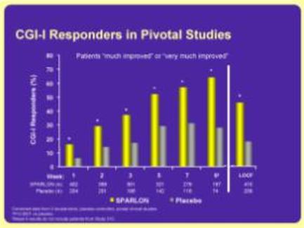
OIDA Image Collection
Filters:
Reset 
A bar graph that shows the number of CGI-I Responders in Pivotal Studies. The x-axis of the graph is labeled with the title "CGI Responders" and the y-axis is labeled as "Patients" and "Plastic". There are six bars in the graph each representing a different period of time. The first bar on the graph shows that the patients who have been diagnosed with CGI responder (CGI) are more likely to have a significant impact on their patients. The second bar shows that they have a higher impact on the patients while the third and fourth bars show a lower impact. The fifth and sixth bars show the percentage of patients who do not have a positive impact on them. The seventh and eighth bars show an increase in the percentage with the highest percentage being in the first bar and the lowest percentage being at the bottom. The ninth and final bars show decreases in the second and third bars indicating a decrease in the number. The tenth and final bar shows a decrease with a slight increase in percentage. The eleventh and final line shows a decline with an increase of percentage.

Description Generated using AI

A bar graph that shows the number of CGI-I Responders in Pivotal Studies. The x-axis of the graph is labeled with the title "CGI Responders" and the y-axis is labeled as "Patients" and "Plastic". There are six bars in the graph each representing a different period of time. The first bar on the graph shows that the patients who have been diagnosed with CGI responder (CGI) are more likely to have a significant impact on their patients. The second bar shows that they have a higher impact on the patients while the third and fourth bars show a lower impact. The fifth and sixth bars show the percentage of patients who do not have a positive impact on them. The seventh and eighth bars show an increase in the percentage with the highest percentage being in the first bar and the lowest percentage being at the bottom. The ninth and final bars show decreases in the second and third bars indicating a decrease in the number. The tenth and final bar shows a decrease with a slight increase in percentage. The eleventh and final line shows a decline with an increase of percentage.

We encourage you to view the image in the context of its source document(s) and cite the source(s) when using these images. However, to cite just this image alone, click the “Cite This Image” button and then paste the copied text.

Information copied to your clipboard:

"A bar graph that shows the number of CGI-I Responders in Pivotal Studies. The x-axis of the graph is labeled with the title "CGI Responders"...