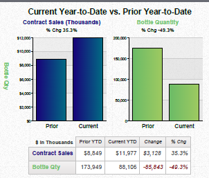
A bar graph that compares the current year-to-date vs. prior year to date of a contract sale. The x-axis of the graph is labeled "Contract Sales (Thousands)" and the y-axis is labeled as "Prior Year-to Date".
There are two bars in the graph one in blue and one in green. The blue bar represents the contract sales while the green bar represents a change in the price of the contract. The graph shows that the contract is in thousands of dollars with the price ranging from $1000000 to $2000.
The graph also shows that in thousands the price has increased from $8849 to $11977 with a price of $3128. The current price has decreased from $3.3% to $4.3%.
At the bottom of the image there is a table that shows the relationship between the two types of contracts. The table has three columns - "Current" "Prior" and "Current". The first column shows the current price the second column shows a change and the third column shows an increase in the quantity of the contracts. There is also a note at the bottom that says "Bottle Qty".
Category
-
Date
2014
Collection
We encourage you to view the image in the context of its source document(s) and cite the source(s) when using these images. However, to cite just this image alone, click the “Cite This Image” button and then paste the copied text.
