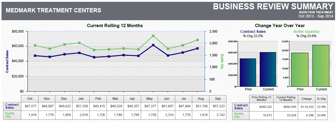
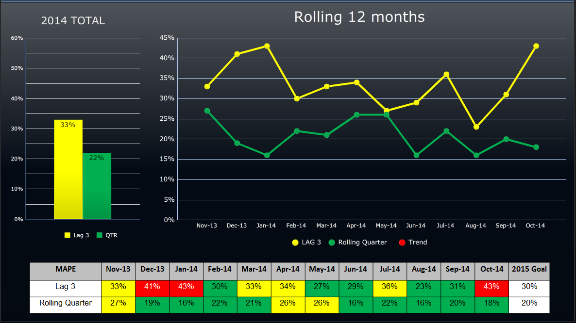
A line graph that shows the number of rolling 12 months in the United States from 2014 to 2015. The x-axis represents the years starting from 2014 and ending in 2015 with the y-axis representing the rolling quarter.
There are three lines in the graph each representing a different period of time. The first line is yellow the second line is green and the third line is orange. The lines are plotted in a horizontal axis with each line representing a month of the year. The yellow line represents the rolling time period while the green line represents a month in the month. The orange line represents an increase in rolling time with a slight decrease in the percentage of rolling hours. The graph also has a legend at the bottom that explains the meaning of each line. The title of the graph is "Rolling 12 Months" and it appears to be a summary of the data.
Source 1 of 2
-
Date
2014
Collection
-
Date
2014
Collection
We encourage you to view the image in the context of its source document(s) and cite the source(s) when using these images. However, to cite just this image alone, click the “Cite This Image” button and then paste the copied text.


