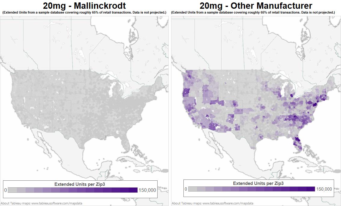
A map of the United States showing the percentage of extended units per zip in each state. The map is divided into two sections one for each state and the other for the other manufacturer.
The map is color-coded with the states in gray and the percentages in purple. The states are labeled with the names of the extended units ranging from 0 to 150000. The percentages range from 0-150000 with some areas having a higher percentage than others. The image also includes a legend at the bottom that explains the meaning of each color in the map.
Category
Source 1 of 6
-
Date
2013
Collection
-
Date
2013
Collection
-
Date
2013
Collection
-
Date
2013
Collection
-
Date
2013
Collection
-
Date
2013
Collection
We encourage you to view the image in the context of its source document(s) and cite the source(s) when using these images. However, to cite just this image alone, click the “Cite This Image” button and then paste the copied text.
