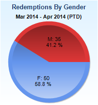
A pie chart that shows the percentage of redemptions by gender in the United States from March 2014 to April 2014. The chart is divided into three sections - red blue and light blue. The red section is the largest with the blue section representing the percentage. The blue section is smaller and has the percentage "F: 50" and "58.8%" written on it. The percentage "M: 35" is higher than the red section indicating that the percentage is 41.2%. The chart also has a label that reads "Redemptions By Gender" at the top.
Category
Source 1 of 5
-
Date
None
Collection
-
Date
2004
Collection
-
Date
2014
Collection
-
Date
2014
Collection
-
Date
None
Collection
We encourage you to view the image in the context of its source document(s) and cite the source(s) when using these images. However, to cite just this image alone, click the “Cite This Image” button and then paste the copied text.


