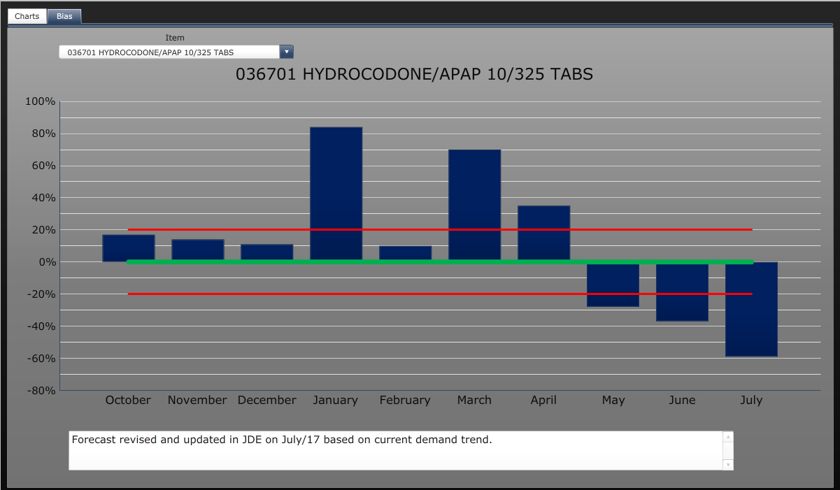
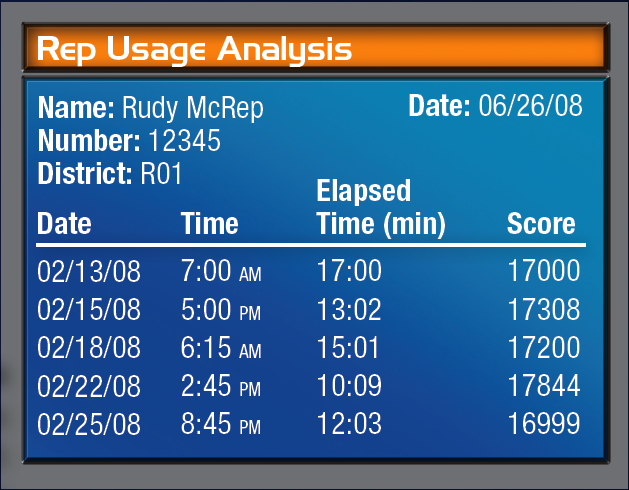
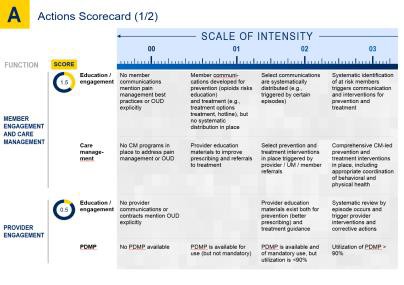
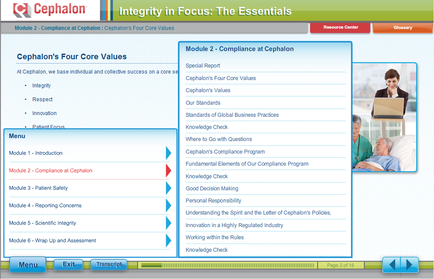
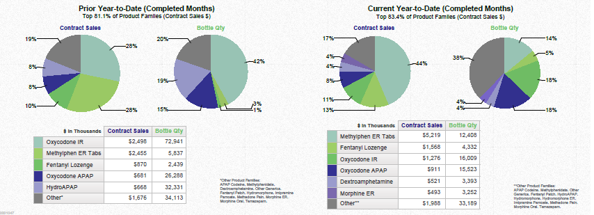
A data visualization consisting of 4 pie charts and 2 tables. The pie charts compare Contract Sales and Bottle Quantity for various opioid drugs (ex : Oxycodone IR) during the Prior Year-to-Date (Completed Months) for the top 81.1% of product families (by Contract Sales dollars) vs. the Current Year-to-Date (Completed Months) for the top 83.4% of product families (by Contract Sales dollars). The company dates and geographic locations are not specified. The background is white with graphic elements in green blue and gray with text in black (primarily).
Description
Category
-
Date
2014
Collection
We encourage you to view the image in the context of its source document(s) and cite the source(s) when using these images. However, to cite just this image alone, click the “Cite This Image” button and then paste the copied text.


