


Title
Description
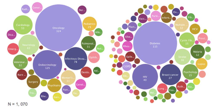
This is two bubble charts. The bubble chart on the left appears to represent medical specialties; its 3 largest bubbles are Oncology Endocrinology and Infectious diseases. The bubble chart on the right appears to represent medical conditions; its 3 largest bubbles are Diabetes HIV and Breast cancer.
Type 
Category
-
Date
2012
Collection
We encourage you to view the image in the context of its source document(s) and cite the source(s) when using these images. However, to cite just this image alone, click the “Cite This Image” button and then paste the copied text.