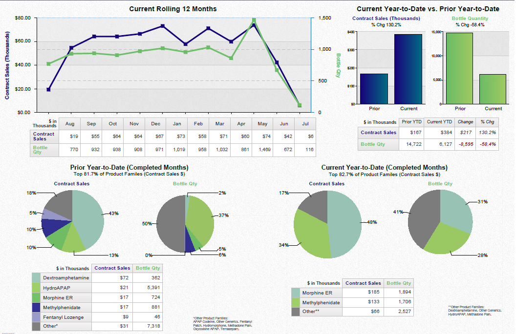
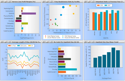
OIDA Image Collection
Filters:
Reset 
A screenshot of a dashboard with six different graphs and charts. The graphs are arranged in a grid-like pattern with each graph representing a different aspect of the data. The first graph on the top left shows a bar graph with different colors representing different data points. The first graph is labeled "Service Line Profit Margin" and shows the percentage of patients who have received a service line profit margin. The second graph is titled "7 Day Readiness Rate by Facility" and has a blue line representing the number of patients. The third graph has a red line representing a percentage of the total number of days of the week. The fourth graph has an orange line representing average length of stay (ALOS) and the fifth graph has two bars representing the average length and average length. The sixth graph has three bars representing one day stays trend. At the bottom of the dashboard there is a title that reads "Average Length of Stay (ALO) by FAN". This suggests that the dashboard is used to analyze and analyze data related to service line profitability.

Description Generated using AI

A screenshot of a dashboard with six different graphs and charts. The graphs are arranged in a grid-like pattern with each graph representing a different aspect of the data. The first graph on the top left shows a bar graph with different colors representing different data points. The first graph is labeled "Service Line Profit Margin" and shows the percentage of patients who have received a service line profit margin. The second graph is titled "7 Day Readiness Rate by Facility" and has a blue line representing the number of patients. The third graph has a red line representing a percentage of the total number of days of the week. The fourth graph has an orange line representing average length of stay (ALOS) and the fifth graph has two bars representing the average length and average length. The sixth graph has three bars representing one day stays trend. At the bottom of the dashboard there is a title that reads "Average Length of Stay (ALO) by FAN". This suggests that the dashboard is used to analyze and analyze data related to service line profitability.

We encourage you to view the image in the context of its source document(s) and cite the source(s) when using these images. However, to cite just this image alone, click the “Cite This Image” button and then paste the copied text.

Information copied to your clipboard:

"A screenshot of a dashboard with six different graphs and charts. The graphs are arranged in a grid-like pattern with each graph representing a diffe...