


Title
Description
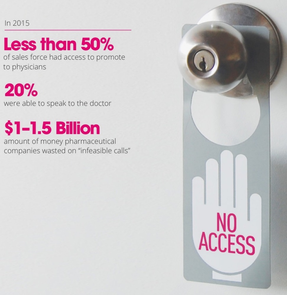
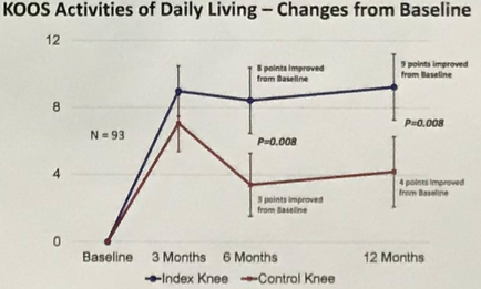
This is a run chart tracking the Knee Injury and Osteoarthritis Outcome Score (KOOS) of 93 subjects over a 12 month period for both their index knee and their control knee. Both the index knee and the control knee show general improvement over time with the most significant improvement occurring during the first 3 months. The KOOS for the index knee then holds steady from month 3 to month 12 but the KOOS for the control knee is more volatile (regressing significantly from month 3 to month 6 then plateauing from month 6 to month 12).
Type 
Category
-
Date
2017
Collection
We encourage you to view the image in the context of its source document(s) and cite the source(s) when using these images. However, to cite just this image alone, click the “Cite This Image” button and then paste the copied text.


![Capsules containing 8 different dosages of Kadian (morphine sulfate) manufactured by Actavis (presumably). The 10 mg dosage is light blue the 20 mg dosage is yellow the 30 mg dosage is purple the 50 mg dosage is royal blue the 60 mg dosage is hot pink the 80 mg dosage is light pink the 100 mg dosage is aqua blue and the 200 mg dosage is brown. All of the capsules are shown both front (ex : KADIAN 10 mg) and back [blank]. The background is light gray with thin black borders and thicker white borders.](https://oida-resources-images.azureedge.net/public/full/ce330557-732b-4334-916d-2075f3fc0681.jpeg)