


Title
Description
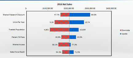
This is a bar chart comparing the downside vs. the upside for 2016 net sales in 6 different categories (Market research discount Units per year Treated population Patient fill rate Market access and Sales force reach). Values are variously expressed as percentages (Market research discount Patient fill rate Market access and Sales force reach) or numerically (Units per year and Treated population). There is also a financial scale on the top line - from $0 to $300000 - but it is unclear which categories it applies to (perhaps just Market research discount?).
Type 
Category
-
Date
2016
Collection
We encourage you to view the image in the context of its source document(s) and cite the source(s) when using these images. However, to cite just this image alone, click the “Cite This Image” button and then paste the copied text.