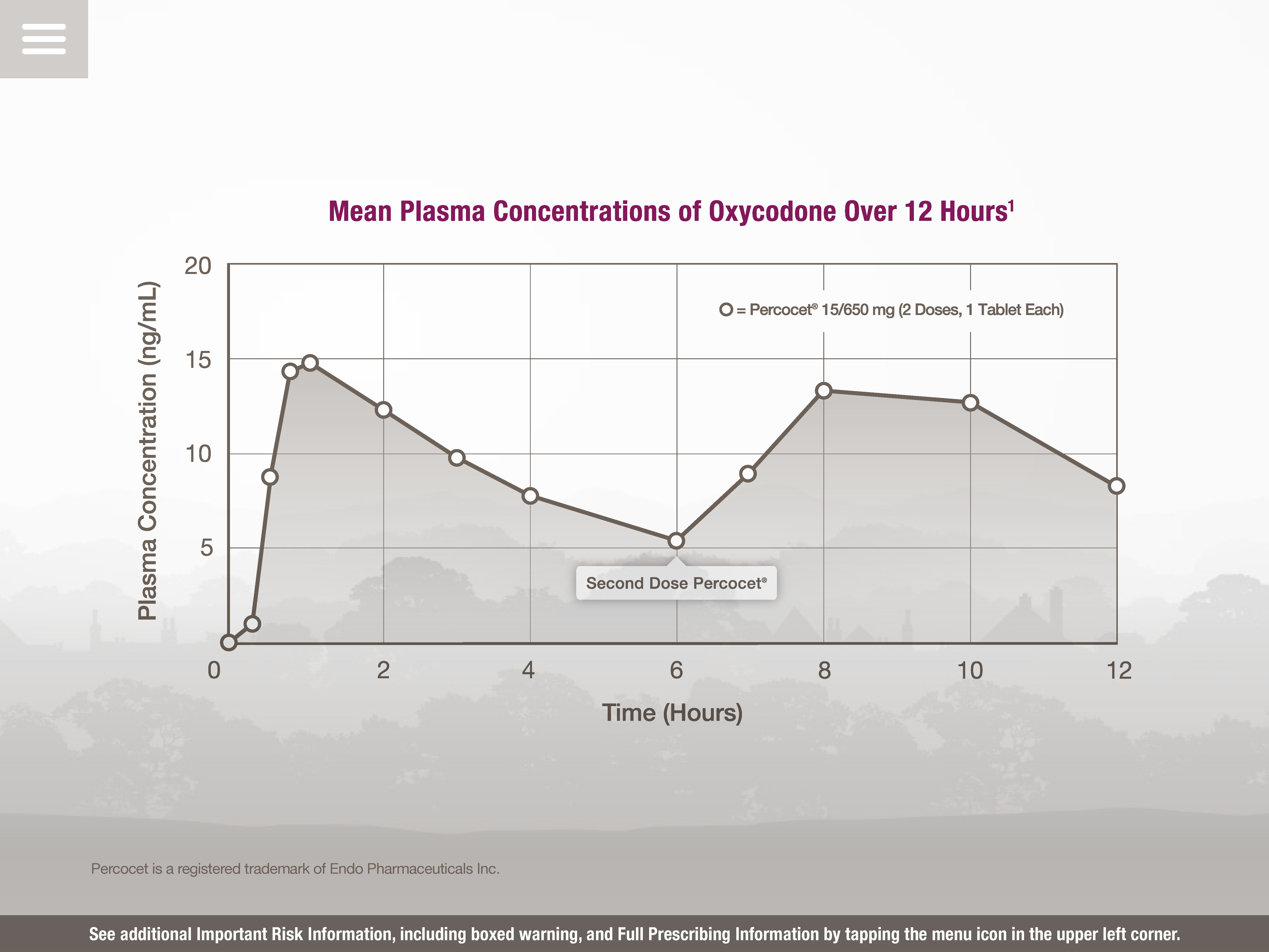
A run chart with the title "Mean Plasma Concentrations of Oxycodone Over 12 Hours" after two doses of Percocet 15/650 mg (1 tablet each separated by 6 hours). Time (Hours) is on the x-axis and Plasma Concentrations (ng/mL) is on the y-axis. The data shows that plasma concentrations rise rapidly for the first hour (peaking at 15 ng/mL) then decline steadily for the next 5 hours (dropping to 5 ng/mL) rise quickly for 2 hours (to 14 ng/mL) then decline slowly for 2 hours (to 13 ng/mL) then decline quickly for 2 hours (to 9 ng/mL). The desired interpretation presumably is that oxycodone does not provide the ideal plasma concentration levels in comparison to an unnamed product. The background is gray and white with graphic elements in gray with text in purple gray and white.
Description
Category
Source 1 of 6
-
Date
None
Collection
-
Date
None
Collection
-
Date
None
Collection
-
Date
2015
Collection
-
Date
2015
Collection
-
Date
2015
Collection
We encourage you to view the image in the context of its source document(s) and cite the source(s) when using these images. However, to cite just this image alone, click the “Cite This Image” button and then paste the copied text.


