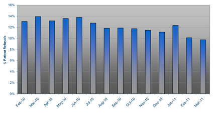
OIDA Image Collection
Filters:
Reset 
A bar graph that shows the number of people who have been diagnosed with cancer in the United States. The x-axis represents the years from February to March and the y-axis indicates the percentage of patients who have experienced cancer. There are six bars in the graph each representing a different period of time. The first bar represents February the second bar represents March the third bar represents April the fourth bar represents May the fifth bar represents June the sixth bar represents July the seventh bar represents August the eighth bar represents September the ninth bar represents October the tenth bar represents November the eleventh bar represents December the twelfth bar represents January the thirteenth bar represents Christmas the last bar represents New Year's Eve the final bar represents Valentine's Day the twenty-sixth bar represents the birth of a new baby the fifteenth and final month of the year the seventeenth and eighteenth months of the month the nineteenth and twenty-eight months of Christmas and finally the twentieth and twenty eight months of February. The bars are arranged in ascending order with the highest bar at the top and the lowest at the bottom. The graph is set against a black background.

Description Generated using AI

A bar graph that shows the number of people who have been diagnosed with cancer in the United States. The x-axis represents the years from February to March and the y-axis indicates the percentage of patients who have experienced cancer. There are six bars in the graph each representing a different period of time. The first bar represents February the second bar represents March the third bar represents April the fourth bar represents May the fifth bar represents June the sixth bar represents July the seventh bar represents August the eighth bar represents September the ninth bar represents October the tenth bar represents November the eleventh bar represents December the twelfth bar represents January the thirteenth bar represents Christmas the last bar represents New Year's Eve the final bar represents Valentine's Day the twenty-sixth bar represents the birth of a new baby the fifteenth and final month of the year the seventeenth and eighteenth months of the month the nineteenth and twenty-eight months of Christmas and finally the twentieth and twenty eight months of February. The bars are arranged in ascending order with the highest bar at the top and the lowest at the bottom. The graph is set against a black background.

We encourage you to view the image in the context of its source document(s) and cite the source(s) when using these images. However, to cite just this image alone, click the “Cite This Image” button and then paste the copied text.

Information copied to your clipboard:

"A bar graph that shows the number of people who have been diagnosed with cancer in the United States. The x-axis represents the years from February t...