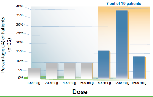
An untitled bar graph. The x-axis of the graph is labeled "Dose" and has values between 100 mcg and 1600 mcg. The y-axis is labeled as "Percentage (%) of Patients (n=32)". Each bar represents the percentage of patients using each dose. The four lowest doses show values between 100 mcg and 600 mcg and each have values of 10% or less. The three highest doses are highlighted in orange and labeled "7 out of 10 patients". The 800 mcg dose shows more than 15% of patients 1200 mcg has almost 40% of patients and 1600 mcg has almost 15%.
Description
Category
Source 1 of 4
-
Date
2012
Collection
-
Date
2013
Collection
-
Date
2012
Collection
-
Date
2012
Collection
We encourage you to view the image in the context of its source document(s) and cite the source(s) when using these images. However, to cite just this image alone, click the “Cite This Image” button and then paste the copied text.
