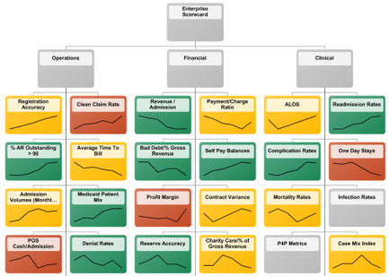
OIDA Image Collection
Filters:
Reset 
A flowchart that shows the organizational structure of an enterprise scorecard. It is divided into different sections each representing a different aspect of the scorecard such as operations financial and clinical. The first section is labeled "Operations" and shows the different types of operations that are represented in the chart. The first section has a list of operations such as "Registration Accuracy" "Clean Claim Rate" "Revenue/Admission" "Payment/Charge Ratio" "ALOS" "Readmission Rates" "One Day Stays" "Mortality Rates" and "Case Mix Index". The second section has an illustration of a graph that shows a decrease in the number of patients who have been diagnosed with cancer. The third section has graphs that show the percentage of patients with cancer the fourth section shows the percentage that has been diagnosed and the fifth section shows that the percentage has decreased the sixth section shows a decline the seventh section shows an increase in the percentage the eighth section shows decreases the ninth section shows decline and finally the tenth section shows improvement the eleventh section shows positive the twelfth section shows negative the thirteenth section shows high the last section shows low the final section shows higher the middle section shows lower the shortest the highest the lowest the smallest the largest the most recent the least recent and most recent. Overall the flowchart is a visual representation of the financial aspects of an Enterprise Scorecard which is a tool used to assess the performance of a company or organization.

Description Generated using AI

A flowchart that shows the organizational structure of an enterprise scorecard. It is divided into different sections each representing a different aspect of the scorecard such as operations financial and clinical. The first section is labeled "Operations" and shows the different types of operations that are represented in the chart. The first section has a list of operations such as "Registration Accuracy" "Clean Claim Rate" "Revenue/Admission" "Payment/Charge Ratio" "ALOS" "Readmission Rates" "One Day Stays" "Mortality Rates" and "Case Mix Index". The second section has an illustration of a graph that shows a decrease in the number of patients who have been diagnosed with cancer. The third section has graphs that show the percentage of patients with cancer the fourth section shows the percentage that has been diagnosed and the fifth section shows that the percentage has decreased the sixth section shows a decline the seventh section shows an increase in the percentage the eighth section shows decreases the ninth section shows decline and finally the tenth section shows improvement the eleventh section shows positive the twelfth section shows negative the thirteenth section shows high the last section shows low the final section shows higher the middle section shows lower the shortest the highest the lowest the smallest the largest the most recent the least recent and most recent. Overall the flowchart is a visual representation of the financial aspects of an Enterprise Scorecard which is a tool used to assess the performance of a company or organization.

We encourage you to view the image in the context of its source document(s) and cite the source(s) when using these images. However, to cite just this image alone, click the “Cite This Image” button and then paste the copied text.

Information copied to your clipboard:

"A flowchart that shows the organizational structure of an enterprise scorecard. It is divided into different sections each representing a different a...