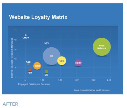
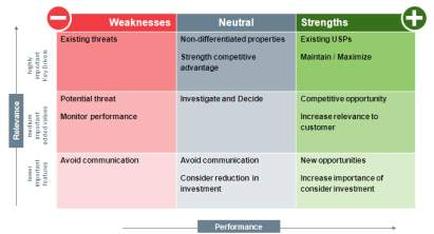
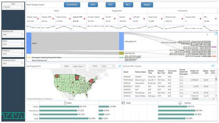
A screenshot of a dashboard with various graphs and charts. The dashboard is divided into different sections each with a different color scheme. The top left section of the dashboard has a title that reads "Summary" and below it there are several graphs that show the results of a survey. The top right section has a line graph that shows the percentage of respondents who have received the survey with the highest percentage being the highest and the lowest being the lowest. The graph shows that the survey has received a significant increase in the number of respondents. In the center of the image there is a map of the United States with red dots scattered across it indicating the locations of the survey participants. The map is color-coded to show the percentage change in the survey results. Below the map there has a bar graph that displays the percentage increase in percentage change over time with different colors representing different data points. The bar graph shows a decrease in percentage of the respondents with some areas having a higher percentage and others having a lower percentage. There are also several charts and graphs that provide further information about the survey's results.

Category
Source 1 of 2
-
Date
2017
Collection
-
Date
2017
Collection
We encourage you to view the image in the context of its source document(s) and cite the source(s) when using these images. However, to cite just this image alone, click the “Cite This Image” button and then paste the copied text.