


Title
Description
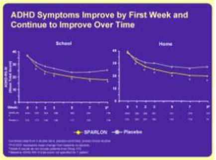
This is two run charts comparing the prevalance of ADHD symptoms in patients being treated with Sparlon vs. a placebo. The run chart on the left tracks ADHD symptoms at school and the run chart on the right tracks ADHD symptoms at home. In all cases the ADHD symptoms diminished over time and diminished more significantly with Sparlon than with the placebo.
Type 
Category
Source 1 of 2
-
Date
2010
Collection
-
Date
2010
Collection
We encourage you to view the image in the context of its source document(s) and cite the source(s) when using these images. However, to cite just this image alone, click the “Cite This Image” button and then paste the copied text.