


Title
Description
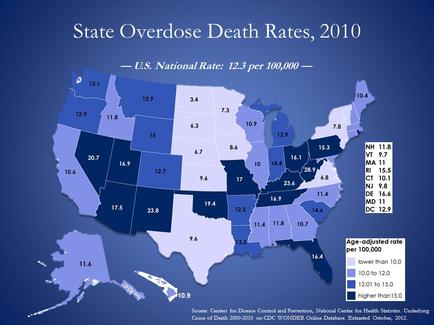
This is a choropleth map showing the overdose death rates for each state in the United States of America (yearly average per 100000 residents for 2000-2010). Rates range from a low of 3.4 deaths per (in North Dakota) to a high of 28.9 per (in West Virginia) with a national average of 12.3 deaths per. The data was compiled by the National Center for Health Statistics of the Centers for Diseases Control and Prevention.
Type 
Category
Source 1 of 3
-
Date
2014
Collection
-
Date
2015
Collection
-
Date
2014
Collection
We encourage you to view the image in the context of its source document(s) and cite the source(s) when using these images. However, to cite just this image alone, click the “Cite This Image” button and then paste the copied text.