


Title
Description
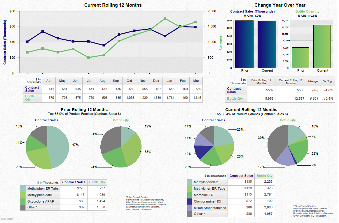
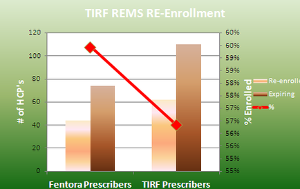
This is two bar charts. The bar chart on the left compares re-enrolled Fentora prescribers vs. expiring Fentora prescribers (on the x-axis) showing the number of HCPs (on the y-axis from 0 to 120) for each. The bar chart on the right compares re-enrolled TIRF prescribers vs. expiring TIRF prescribers (on the x-axis) showing the percentages (on the y-axis from 55% to 60%) for each. There is a red trend line between the two bar charts which appears to be negative but its meaning and significance are not stated explicitly.
Type 
Category
Source 1 of 4
-
Date
2013
Collection
-
Date
2013
Collection
-
Date
2013
Collection
-
Date
2013
Collection
We encourage you to view the image in the context of its source document(s) and cite the source(s) when using these images. However, to cite just this image alone, click the “Cite This Image” button and then paste the copied text.