OIDA Image Collection
Filters:
Reset 
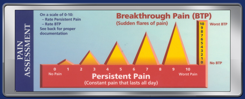
A bar graph that shows the relationship between breakthrough pain (BTP) and persistent pain. The x-axis of the graph is labeled "Persistent Pain" and the y-axis is labeled as "Constant pain that lasts all day". The graph shows that on a scale of 0-10 the rate of persistent pain is higher than the rest of the pain.<br /><br />There are three bars in the graph each representing a different period of time. The first bar is labeled with the number of patients who have been diagnosed with BTP the second bar is colored orange and the third bar is yellow. The bars are arranged in a vertical line with the highest bar at the top and the lowest at the bottom. The highest bar represents the lowest pain while the lowest bars represent the worst pain. <br /><br />The graph also has a label on the left side that reads "Pain Assessment" and on the right side there is a text that explains that the data is based on the data. The text also mentions that there are no BTP (Batteries and Batteries) in the chart.

Description Generated using AI

A bar graph that shows the relationship between breakthrough pain (BTP) and persistent pain. The x-axis of the graph is labeled "Persistent Pain" and the y-axis is labeled as "Constant pain that lasts all day". The graph shows that on a scale of 0-10 the rate of persistent pain is higher than the rest of the pain.

There are three bars in the graph each representing a different period of time. The first bar is labeled with the number of patients who have been diagnosed with BTP the second bar is colored orange and the third bar is yellow. The bars are arranged in a vertical line with the highest bar at the top and the lowest at the bottom. The highest bar represents the lowest pain while the lowest bars represent the worst pain.

The graph also has a label on the left side that reads "Pain Assessment" and on the right side there is a text that explains that the data is based on the data. The text also mentions that there are no BTP (Batteries and Batteries) in the chart.

Category Generated using AI

We encourage you to view the image in the context of its source document(s) and cite the source(s) when using these images. However, to cite just this image alone, click the “Cite This Image” button and then paste the copied text.

Information copied to your clipboard:

"A bar graph that shows the relationship between breakthrough pain (BTP) and persistent pain. The x-axis of the graph is labeled "Persistent Pain...