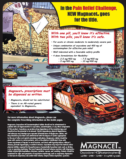


Title
Description
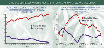
This is two run charts discussing cigarette use (at least half a pack per day) & perception of harm by 12th grade students and discussing marijuana use & perception of harm by 12th grade students. Both run charts have years on the x-axis (from 1975 to 2013) and perceived risk of harm on the y-axis (expressed as a percentage from 0 to 100). In both run charts the general trend is that drug use and perceived risk of harm are very strongly correlated - that is drug use decreases as the perceived risk of harm rises - although both variables are more volatile for marijuana than they are for cigarettes (for which usage has declined steadily while perceived risk of harm has risen steadily).
Type 
Category
-
Date
2014
Collection
We encourage you to view the image in the context of its source document(s) and cite the source(s) when using these images. However, to cite just this image alone, click the “Cite This Image” button and then paste the copied text.