


Title
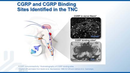
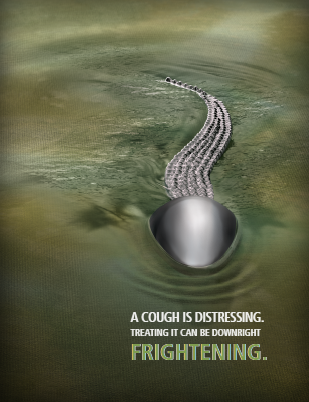
Description
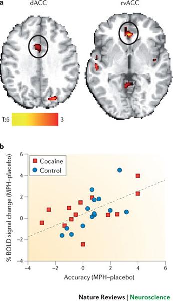
This is two data visualizations : a heat map of the brain (showing both the dorsal anterior cingulate cortex (dACC) and the rostral-ventral anterior cingulate cortex (rvACC)) and a scatter plot (comparing the percentage of BOLD ((blood-oxygen-level-dependent) signal change for cocaine vs. control). The heat map shows both location and intensity on a scale of T:6 (yellow) to 3 (red). The scatter plot has Accuracy (MPH-placebo) on the x-axis and % BOLD signal change (MPH-placebo) on the y-axis with control represented by blue dots and cocaine represented by red boxes.
Type 
Category
Source 1 of 2
-
Date
2014
Collection
-
Date
2014
Collection
We encourage you to view the image in the context of its source document(s) and cite the source(s) when using these images. However, to cite just this image alone, click the “Cite This Image” button and then paste the copied text.


![A web-based advertisement for Ofirmev (acetaminophen injection) from the Ofirmev website (presumably) with the tagline "Less pain. Less opioids. From the start. : Consider administering Ofirmev pre-op then scheduling [illegible]". It includes product benefits (in the form of a bullet point list) Indications and Usage and Important Risk Information (in the form of a boxed warning). There is also a picture of bottle of Ofirmev (on the right) a menu bar with 5 options (at the top) and the logo of Ofirmev (in the bottom right corner).](https://oida-resources-images.azureedge.net/public/full/b920f06b-13fa-4b0f-92e0-7261ba2af477.jpeg)