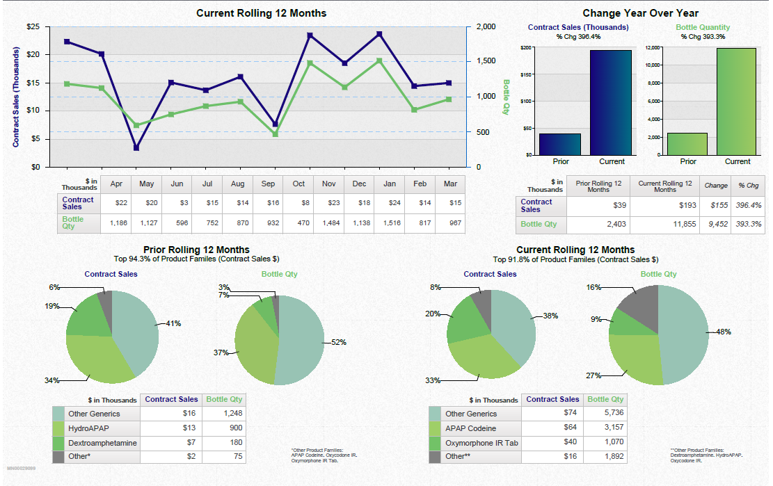


Title
Description
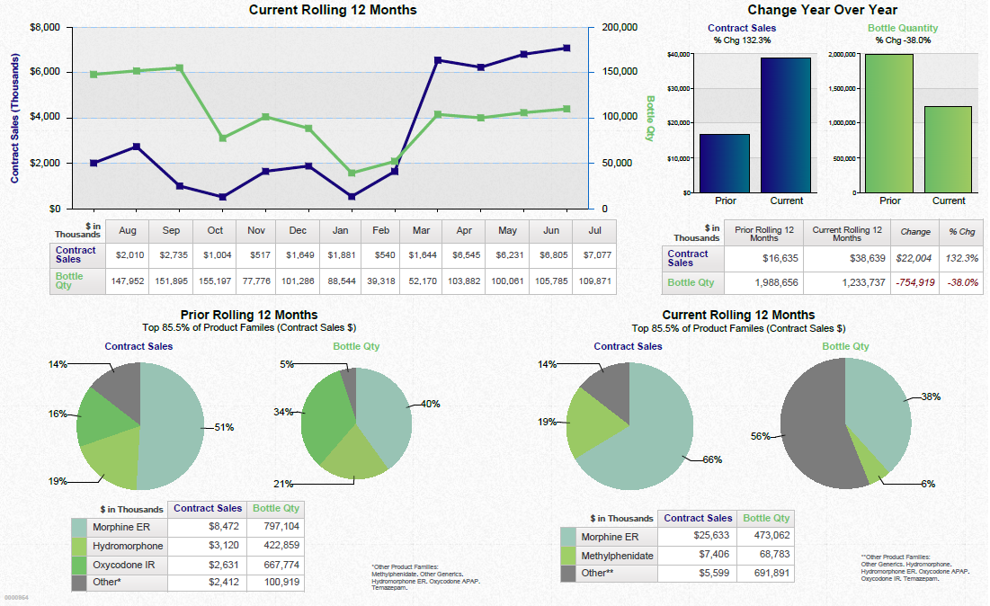
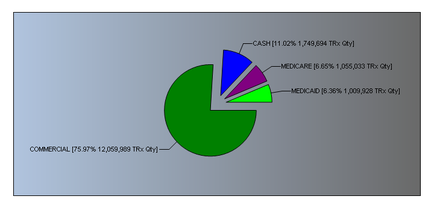
This is a pie chart showing the revenue sources for an unidentified drug. Most of the revenue comes from Commercial (75.97%) followed by Cash (11.02%) Medicare (6.65%) and Medicaid (6.36%). TRx Qty is also listed for each revenue source.
Type 
Category
Source 1 of 2
-
Date
2018
Collection
-
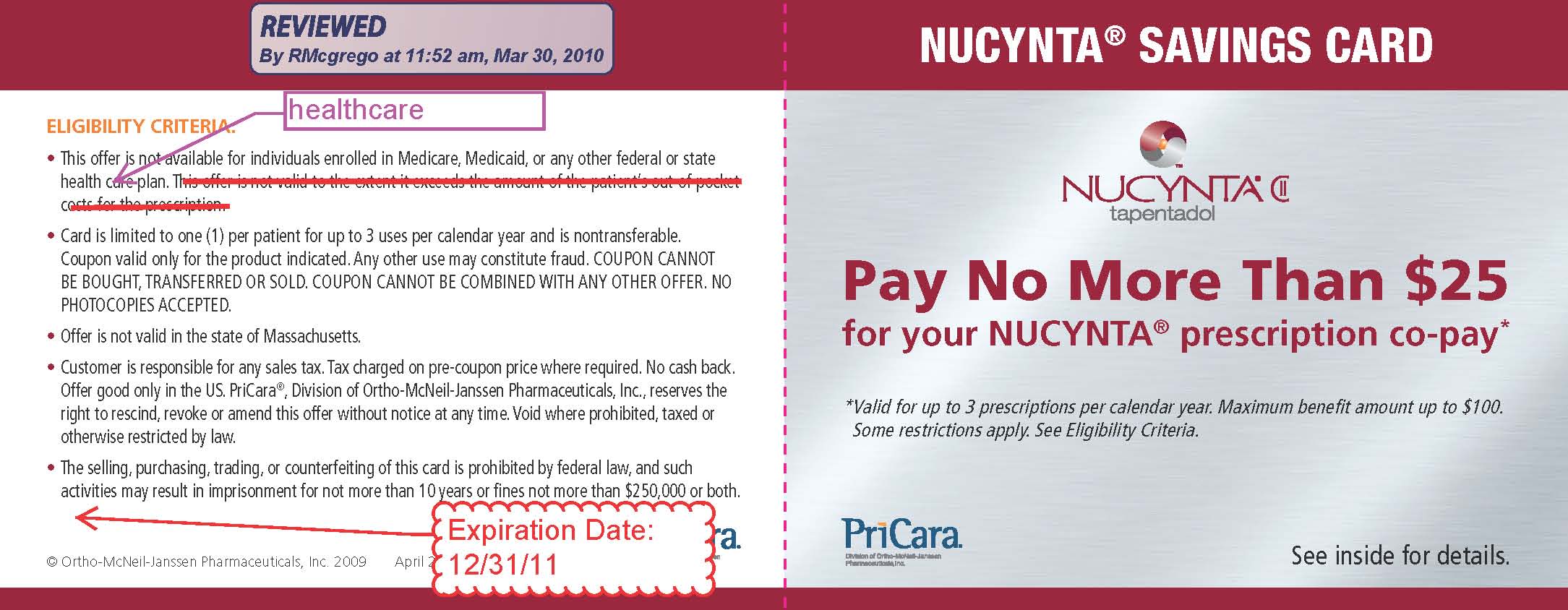
Date
2011
Collection
We encourage you to view the image in the context of its source document(s) and cite the source(s) when using these images. However, to cite just this image alone, click the “Cite This Image” button and then paste the copied text.