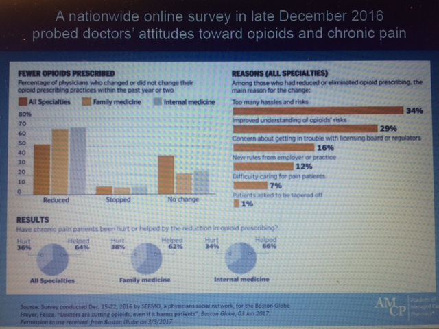
A photograph of screen showing a slide from a presentation. The slide is titled "A nationwide online survey in late December 2016 that probed doctors' attitudes toward opioids and chronic pain".
On the left there is a bar chart titled "Fewer opioids prescribed: Percentage of physicians who changed or did not change their opioid prescribing practices within the past year or two." It shows values for all specialties family medicine and internal medicine. It shows that 50%-70% of physicians reduced fewer than 10% stopped and 20%-40% had no change.
On the right there is a bar chart titled "Reasons (all specialties): Among those who had reduced or eliminated opioid prescribing the main reason for the change:". It showed that 34% of physicians noted too many hassles and risks and 29% had an improved understanding of opioids' risks as well as three other options.
At the bottom there are three pie charts labeled "Results: Have chronic pain patients been hurt or helped by the reduction in opioid prescribing?" Each chart shows a different specialty and each shows that about two-thirds chose "helped" and one-third chose "hurt".
The footer on the slide has the AMCP logo.
Description
Type
Category
-
Date
None
Collection
We encourage you to view the image in the context of its source document(s) and cite the source(s) when using these images. However, to cite just this image alone, click the “Cite This Image” button and then paste the copied text.


