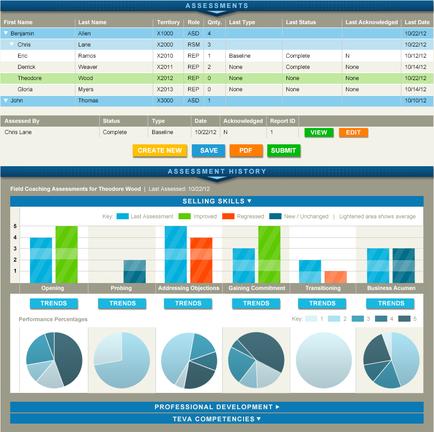
OIDA Image Collection
Filters:
Reset 
A screenshot of a dashboard that is used to assess the performance of a company. The dashboard is divided into different sections each representing a different aspect of the company's performance. At the top of the dashboard there is a table that shows the first name last name and last status of the assessment. Below the table there are three columns - "Assessments" "Selling Skills" and "Professional Development". The first column shows the company name and the last status while the second column displays the sales skills. The third column shows a bar graph that shows that the company has achieved a high level of success in the sales process. The fourth column shows an increase in sales skills with the highest sales skills being the highest and the lowest being the lowest. The fifth column shows that sales skills have increased with a slight decrease in sales. The sixth column shows how sales skills are increasing with an increase of sales in the first and last years. The seventh column shows sales skills in the second and final years with sales skills having a slight decline in sales and sales in last year. The dashboard also includes a section titled "Create New Assessment History" which provides information about the company and its assessment history. There are also several pie charts and graphs that show the different aspects of sales such as performance percentages trends and professional development.

Description Generated using AI

A screenshot of a dashboard that is used to assess the performance of a company. The dashboard is divided into different sections each representing a different aspect of the company's performance. At the top of the dashboard there is a table that shows the first name last name and last status of the assessment. Below the table there are three columns - "Assessments" "Selling Skills" and "Professional Development". The first column shows the company name and the last status while the second column displays the sales skills. The third column shows a bar graph that shows that the company has achieved a high level of success in the sales process. The fourth column shows an increase in sales skills with the highest sales skills being the highest and the lowest being the lowest. The fifth column shows that sales skills have increased with a slight decrease in sales. The sixth column shows how sales skills are increasing with an increase of sales in the first and last years. The seventh column shows sales skills in the second and final years with sales skills having a slight decline in sales and sales in last year. The dashboard also includes a section titled "Create New Assessment History" which provides information about the company and its assessment history. There are also several pie charts and graphs that show the different aspects of sales such as performance percentages trends and professional development.

We encourage you to view the image in the context of its source document(s) and cite the source(s) when using these images. However, to cite just this image alone, click the “Cite This Image” button and then paste the copied text.

Information copied to your clipboard:

"A screenshot of a dashboard that is used to assess the performance of a company. The dashboard is divided into different sections each representing a...