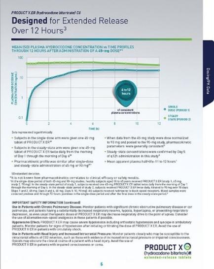
OIDA Image Collection
Filters:
Reset 
A line graph that shows the relationship between the product X and the extended release over 12 hours. The x-axis of the graph is labeled "Product X" and the y-axis is labeled as "Over 12 Hours". The graph shows that the product has been designed for extended release as indicated by the title "Designed for Extended Release" at the top. The graph has a blue line that fluctuates between the two periods of time with the x-y axis representing the time period and the line representing the duration of the release. The line is plotted on a white background and there is a green circle in the center of the chart. The green circle is labeled with the product name and the date "12 hours". Below the graph there is text that explains the concept of extended release and how it can be used to increase the release of the product over time. The text also mentions that when the product is released from the 45-day period it is important to ensure that the release is safe and secure. The graph also includes a legend that explains that the data is presented in a clear and concise manner making it easy to read and understand.

Description Generated using AI

A line graph that shows the relationship between the product X and the extended release over 12 hours. The x-axis of the graph is labeled "Product X" and the y-axis is labeled as "Over 12 Hours". The graph shows that the product has been designed for extended release as indicated by the title "Designed for Extended Release" at the top. The graph has a blue line that fluctuates between the two periods of time with the x-y axis representing the time period and the line representing the duration of the release. The line is plotted on a white background and there is a green circle in the center of the chart. The green circle is labeled with the product name and the date "12 hours". Below the graph there is text that explains the concept of extended release and how it can be used to increase the release of the product over time. The text also mentions that when the product is released from the 45-day period it is important to ensure that the release is safe and secure. The graph also includes a legend that explains that the data is presented in a clear and concise manner making it easy to read and understand.

We encourage you to view the image in the context of its source document(s) and cite the source(s) when using these images. However, to cite just this image alone, click the “Cite This Image” button and then paste the copied text.

Information copied to your clipboard:

"A line graph that shows the relationship between the product X and the extended release over 12 hours. The x-axis of the graph is labeled "Produ...