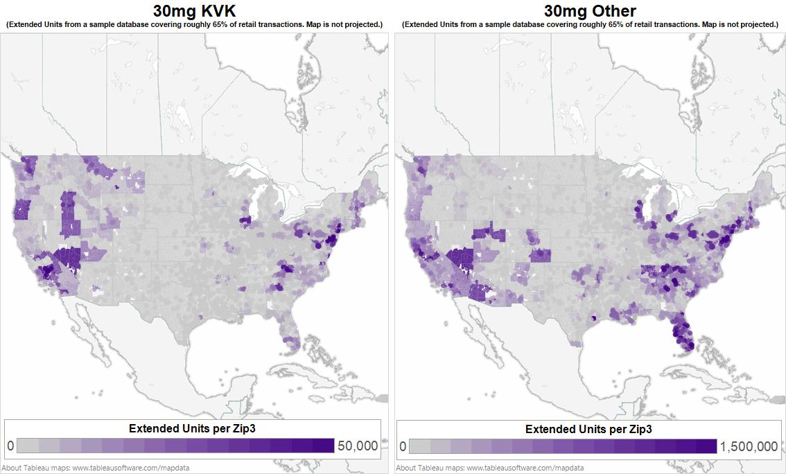
Two maps of North America with a focus on the United States of America. It shows the borders of each county. Each county is filled in with different shades on a gradient from grey to purple. The map on the left is titled "30mg KVK" and the map on the right is titled "30mg Other". Under each title there is a disclaimer that reads "(Extended Units from a sample database covering roughly 65% of retail transactions. Data is not projected.)" A key shows that the color represents extended units per Zip3 with grey indicating 0 units and the darkest color purple indicating up to 50000 units for the map on the left and 1500000 units for the map on the right. A footer on the map indicates that the graphic was created in Tableau.
Category
-
Date
2013
Collection
We encourage you to view the image in the context of its source document(s) and cite the source(s) when using these images. However, to cite just this image alone, click the “Cite This Image” button and then paste the copied text.
