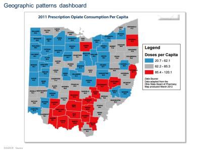
A map of the state of Ohio titled "2011 prescription opiate consumption per capita." The map is broken into smaller regions possibly counties and color-coded with different shades representing different doses per capita. According to the legend the blue represents 20.7-62.1 doses per capita the grey represents 62.2-85.3 doses per capita and the red represents 85.4-120.1 doses per capita. There is also text that reads "Geographic patterns dashboard".
Category
-
Date
2017
Collection
We encourage you to view the image in the context of its source document(s) and cite the source(s) when using these images. However, to cite just this image alone, click the “Cite This Image” button and then paste the copied text.
