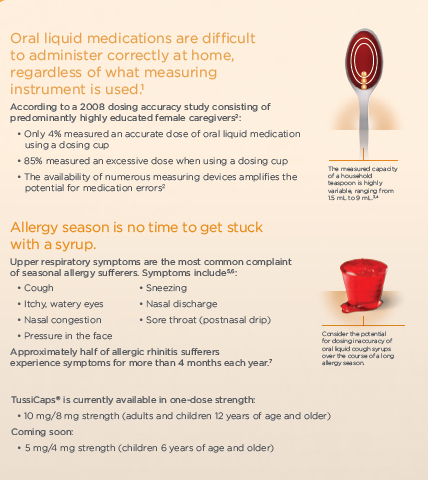
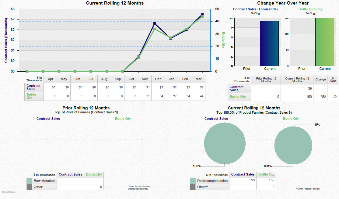
A dashboard showing a business review summary. It is split into three sections. On the top left it shows a line graph that show the current rolling 12 months for contract sales and bottle quantity with a table of supporting data underneath.
On the top right there are two bar charts showing the change year over year for contract sales and bottle quantity with a table of supporting data underneath.
Along the bottom there are two pie charts showing the current rolling 12 months for contract sales and bottle quantity respectively. Two tables of supporting data are underneath.
Description
Source 1 of 3
-
Date
2017
Collection
-
Date
2017
Collection
-
Date
2017
Collection
We encourage you to view the image in the context of its source document(s) and cite the source(s) when using these images. However, to cite just this image alone, click the “Cite This Image” button and then paste the copied text.



![A screenshot of a draft version of the homepage of the REMS ASAP website consisting primarily of placeholder text and images. There are also two infographics with titles "Nearly 1 per AMA [sic?] of 4 prescription drug overdoses is caused by opioid painkillers" and "10 of the highest prescribing states for painkillers are in the South" (with a color coded map).](https://oida-resources-images.azureedge.net/public/full/22b9f61e-4deb-4d14-bdfc-c9a42345bcca.png)
