Title
Description
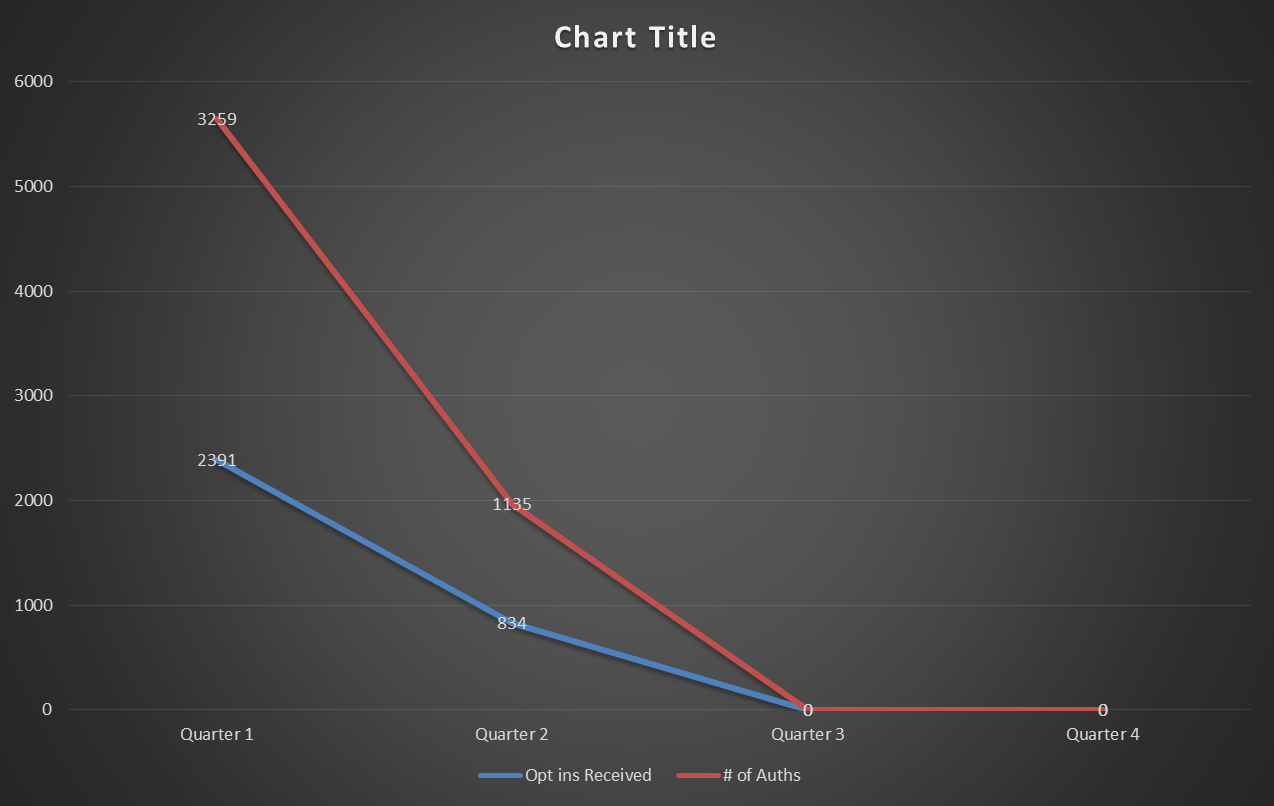
An untitled line graph that shows the relationship between the number of Authorizations (in red) and the number of opt ins Received (in blue) per quarter (over the course of an unidentified year). The number of Authorizations is always higher than the number of opt ins Received. Both numbers decline between Quarter 1 and Quarter 2 then hit zero for Quarter 3 and Quarter 4.
Category
-
Date
2014
Collection
We encourage you to view the image in the context of its source document(s) and cite the source(s) when using these images. However, to cite just this image alone, click the “Cite This Image” button and then paste the copied text.


