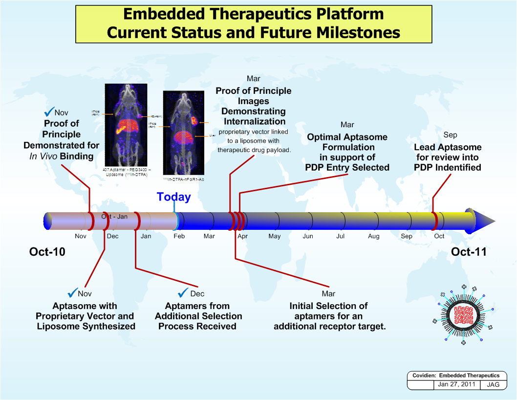
A map of the Embedded Therapeutics Platform which is a platform that provides current status and future milestones. The map is divided into three sections each representing a different stage of the platform.
The first section is titled "Proof of Principle Demonstrated for Vivo Binding" and shows a diagram of a blood vessel with a red and blue color scheme. The diagram shows the flow of blood from the vessel to the vessel with the red and yellow color scheme representing the blood vessels. The blue and red color scheme represents the blood flow while the yellow and green color scheme represent the blood vessel.
There are also three smaller images on the map one of which shows the different stages of the process. The first image on the left shows a blood sample the second image shows a sample of the sample and the third image shows an image of a sample with a sample in the sample. The text on the right side of the image reads "Optimal Aptasome Formulation in support of PDF Entry Selected".
At the bottom right corner there is a red circle with the text "Oct-10" and a white circle with a blue line representing the initial selection of additional receptors for an additional receptor target. This suggests that the platform is used to measure the progress of a patient's blood flow through the process and provide information about the current status of the patient.
Type
Category
Source 1 of 2
-
Date
2011
Collection
-
Date
2010
Collection
We encourage you to view the image in the context of its source document(s) and cite the source(s) when using these images. However, to cite just this image alone, click the “Cite This Image” button and then paste the copied text.
