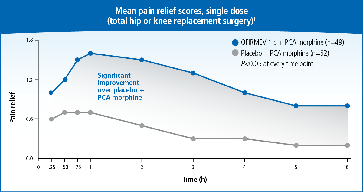
A line graph that shows the mean pain relief scores single dose (total hip or knee replacement surgery) for different types of pain relief. The x-axis represents the time period and the y-axis indicates the number of pain relievers in each type of treatment.
There are two lines in the graph one for pain relief and one for PCA morphine. The pain relief line is plotted on the left side of the graph and the PCAmorphine line is on the right side. The line on the graph shows that the pain relief score is 1.8% indicating that the patient has a significant improvement in the treatment over time. The percentage of pain in each treatment is 0.25% and the percentage in the percentage is 2.5%.
The graph also has a legend at the bottom that explains the meaning of each line. The legend explains that there are two points on the line - "Significant improvement" and "PCA morphine".
Category
Source 1 of 8
-
Date
2017
Collection
-
Date
2017
Collection
-
Date
2015
Collection
-
Date
2015
Collection
-
Date
2015
Collection
-
Date
2017
Collection
-
Date
2016
Collection
-
Date
2015
Collection
We encourage you to view the image in the context of its source document(s) and cite the source(s) when using these images. However, to cite just this image alone, click the “Cite This Image” button and then paste the copied text.
