Title
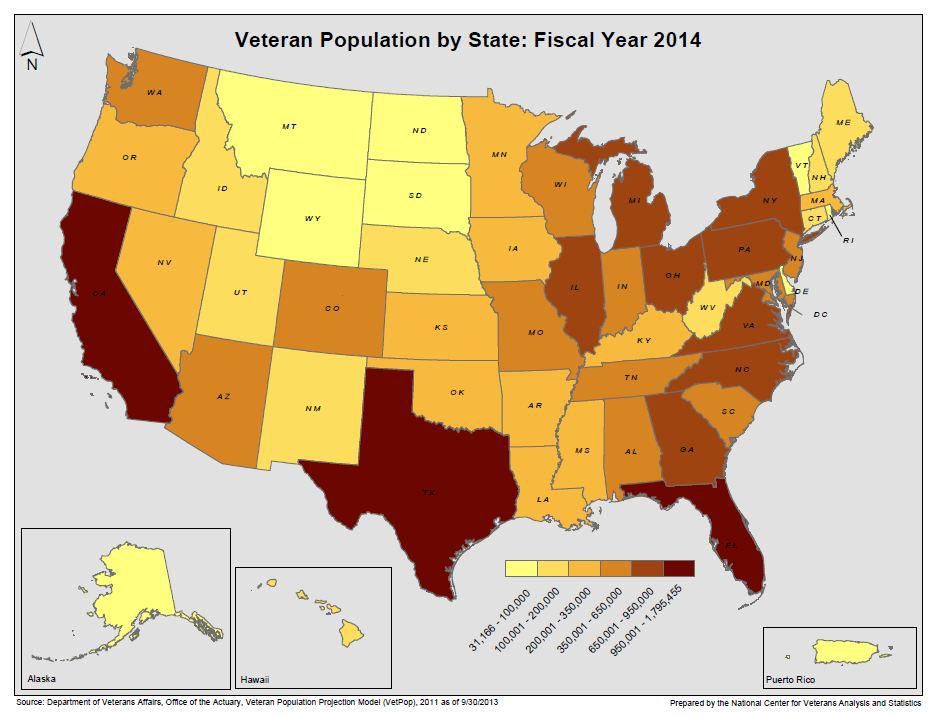
A map of the United States showing the percentage of veteran population by state in fiscal year 2014. The map is color-coded with different shades of orange representing different areas of the country. The majority of the states are in red or yellow.
The map also includes a legend at the bottom that explains the different colors used in the map. The colors range from light yellow to dark red with the darker red representing the percentage. The text at the top of the image reads "Veteran Population by State: Fiscal Year 2014".
Category
Source 1 of 14
-
Date
None
Collection
-
Date
2015
Collection
-
Date
None
Collection
-
Date
2014
Collection
-
Date
None
Collection
-
Date
None
Collection
-
Date
None
Collection
-
Date
None
Collection
-
Date
None
Collection
-
Date
None
Collection
-
Date
2014
Collection
-
Date
None
Collection
-
Date
None
Collection
-
Date
None
Collection
We encourage you to view the image in the context of its source document(s) and cite the source(s) when using these images. However, to cite just this image alone, click the “Cite This Image” button and then paste the copied text.


