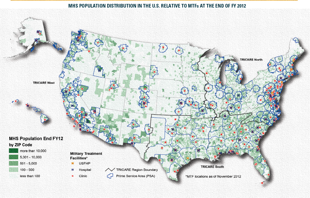
A map of the United States showing the population distribution in the U.S. relative to the end of FY 2012. The map is color-coded with different shades of green representing different areas of the country. The green areas represent military treatment facilities while the blue areas represent civilian treatment facilities.
The map also includes a legend that explains the different colors used in the map. The colors range from light blue to dark blue with some areas being darker blue and others being lighter blue. The text on the map provides further information about the population such as the number of people living in each area and the percentage of people who have been diagnosed with cancer.
Category
Source 1 of 13
-
Date
None
Collection
-
Date
2015
Collection
-
Date
2014
Collection
-
Date
None
Collection
-
Date
None
Collection
-
Date
None
Collection
-
Date
None
Collection
-
Date
None
Collection
-
Date
None
Collection
-
Date
2014
Collection
-
Date
None
Collection
-
Date
None
Collection
-
Date
None
Collection
We encourage you to view the image in the context of its source document(s) and cite the source(s) when using these images. However, to cite just this image alone, click the “Cite This Image” button and then paste the copied text.
