OIDA Image Collection
Filters:
Reset 
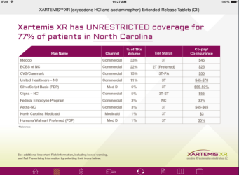
A screenshot of a table that shows the percentage of patients in North Carolina who have unrestricted coverage for Xartemis XR. The table is divided into three columns and three rows. The first column lists the names of the patients the second column shows the channel and the third column displays the total number of patients.<br /><br />At the top of the table there is a heading that reads "XARTEMIS XR has UNRESTRICTED COVERAGE FOR 77% OF PATIENTS IN NORTH CAROLINA". Below the heading there are two buttons - "PAN NAME" and "CHANNEL". The first button is labeled "Channel" and the second button is titled "Channel".<br /><br />The table also has a table with three columns each representing a different channel. The channels are:<br /><br />- Commercial Commercial and Commercial with the channel being the largest and the channel having the highest number of channel coverage. The channel has the lowest channel coverage while the channel has a higher number of channels. The chart also shows the total coverage for each channel with each channel having a channel name and channel number.<br />- Coronavirus coverage which is the highest in the United States. The total coverage is for the first channel which has the highest coverage and that the channel is the lowest in the second channel.

Description Generated using AI

A screenshot of a table that shows the percentage of patients in North Carolina who have unrestricted coverage for Xartemis XR. The table is divided into three columns and three rows. The first column lists the names of the patients the second column shows the channel and the third column displays the total number of patients.

At the top of the table there is a heading that reads "XARTEMIS XR has UNRESTRICTED COVERAGE FOR 77% OF PATIENTS IN NORTH CAROLINA". Below the heading there are two buttons - "PAN NAME" and "CHANNEL". The first button is labeled "Channel" and the second button is titled "Channel".

The table also has a table with three columns each representing a different channel. The channels are:

- Commercial Commercial and Commercial with the channel being the largest and the channel having the highest number of channel coverage. The channel has the lowest channel coverage while the channel has a higher number of channels. The chart also shows the total coverage for each channel with each channel having a channel name and channel number.
- Coronavirus coverage which is the highest in the United States. The total coverage is for the first channel which has the highest coverage and that the channel is the lowest in the second channel.

We encourage you to view the image in the context of its source document(s) and cite the source(s) when using these images. However, to cite just this image alone, click the “Cite This Image” button and then paste the copied text.


Information copied to your clipboard:

"A screenshot of a table that shows the percentage of patients in North Carolina who have unrestricted coverage for Xartemis XR. The table is divided ...