Title
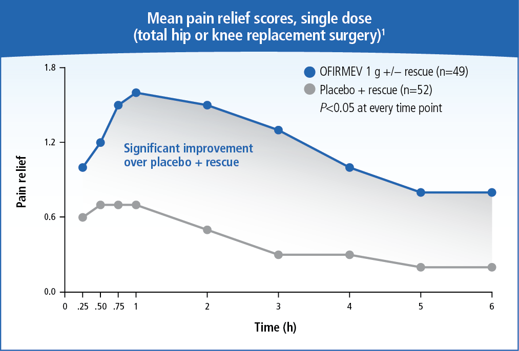
A line graph that shows the mean pain relief scores single dose (total hip or knee replacement surgery) and the significant improvement over placebo + rescue. The x-axis represents the time period while the y-axis indicates the number of patients who have experienced pain relief.
There are two lines in the graph one representing pain relief and the other representing significant improvement. The line on the left represents pain relief and the line in the middle represents the percentage of patients with pain. The highest percentage is 0.25% while the lowest percentage is 2%.
The graph shows that pain relief has increased over time with the highest percentage being around 0.6%. The percentage is around 1.8% indicating a decrease in pain relief over time. There is also a note on the right side of the graph that states that the percentage has decreased over time and that there is a significant improvement in the percentage.
Type
Category
-
Date
2015
Collection
We encourage you to view the image in the context of its source document(s) and cite the source(s) when using these images. However, to cite just this image alone, click the “Cite This Image” button and then paste the copied text.


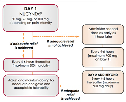
![This is a diagram explaining how the Pathways of pain work. NMDA-mediated signaling (1) Disinhibition (2) and Microglia activation (3) are all discussed as well as how Touch and Pain are processed by the Brain. It was created by A. Bassbaum [et al.] in 2009 for Cell then used by Teva Pharmaceuticals at a later date.](https://oida-resources-images.azureedge.net/public/full/7b6ab15e-10b5-4f82-89d6-a999f519fc6e.png)
