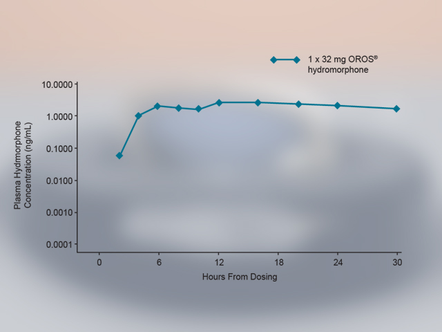
A run chart showing how Plasma Hydromorphone Concentration (ng/mL) (on the y-axis) changes over time (on the x-axis) for pain patients that ingest one dosage of 32 mg OROS hydromorphone. The Concentration is measured in ng/mL from 0.0001 to 10.0000 but is not drawn to scale. The Time is measured in hours from 0 to 30 in 6 hour increments and is drawn to scale. The data shows that the dosage of hydromorphone takes approximately 2 hours to climb from zero (presumably) to 0.1000 ng/mL climbs steadily for another 4 hours until it reaches 3.0000 ng/mL climbs steadily for another 6 hours until it reaches 5.0000 ng/mL then drops steadily for the next 18 hours until it reaches 2.0000 ng/mL. Exact values in ng/mL are not listed however and the idiosyncratic scaling makes precise readings difficult. The background is white and gray with graphic elements in blue and text in black.
Description
Category
Source 1 of 5
-
Date
2009
Collection
-
Date
2009
Collection
-
Date
2009
Collection
-
Date
2009
Collection
-
Date
2009
Collection
We encourage you to view the image in the context of its source document(s) and cite the source(s) when using these images. However, to cite just this image alone, click the “Cite This Image” button and then paste the copied text.





![A flow chart describing the pain management process from a physician's perspective in 5 sections accompanied by 7 annotations (marked by stars pointing to text boxes). The sections are Origin Evaluation and Diagnosis Treatment Choices [something to do with insurance coverage for prescriptions?] and Persistency. The annotations appear to refer to ways that Mallinckrodt Pharmaceuticals could increase the awareness sales and profitability of Exalgo. The background is white with graphic elements in blue gray green and yellow with text in black red and green.](https://oida-resources-images.azureedge.net/public/full/c3a89e52-3266-47c0-9ed9-fe67133608e2.png)


