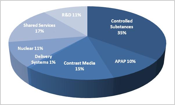
A pie chart that shows the percentage of shared services in the United States. The chart is divided into three sections each representing a different type of service.
The largest section in the chart is R&D 11% which is represented by a blue circle. The other three sections are:
- Shared Services 17% Nuclear 11% Delivery Systems 1% Contrast Media 15% and APAP 10%.
- Controlled Substances 35% which are represented by the blue circles. The largest section is labeled "Controlled Substances" and shows that the majority of the services are distributed while the smallest section is labeled "Contrast Media".
Overall the chart shows that shared services are 17% of the total with nuclear 11% being the most distributed.
Category
Source 1 of 7
-
Date
2013
Collection
-
Date
2013
Collection
-
Date
2013
Collection
-
Date
2013
Collection
-
Date
2013
Collection
-
Date
2013
Collection
-
Date
2013
Collection
We encourage you to view the image in the context of its source document(s) and cite the source(s) when using these images. However, to cite just this image alone, click the “Cite This Image” button and then paste the copied text.





![A screenshot of the Formulary update page of the Xartemis™ XR (oxycodone HCI and acetaminophen Extended-Release Tablets (CII) website. The page has a white background with a green and purple color scheme. The header reads "Formulary update" in bold purple font. Below the header there is a text box that reads "XARTEMIS XR is available unrestricted on Tier 3 for State of Connecticut EMP (CT) Commercial Patients. No PA/Step therapy requirement. Patients will have an average co-pay of [S]." <br /><br />At the bottom of the page there are four buttons each reading "Formulary Update". The website appears to be a mock-up and it appears that some placeholder text exists between brackets.<br /><br />The page also has a navigation bar at the bottom of the page which shows that the "Formulary Updates" section is selected.](https://oida-resources-images.azureedge.net/public/full/c4b34ebc-dbfb-4b3f-b1f4-387298601786.jpeg)
