OIDA Image Collection
Filters:
Reset 
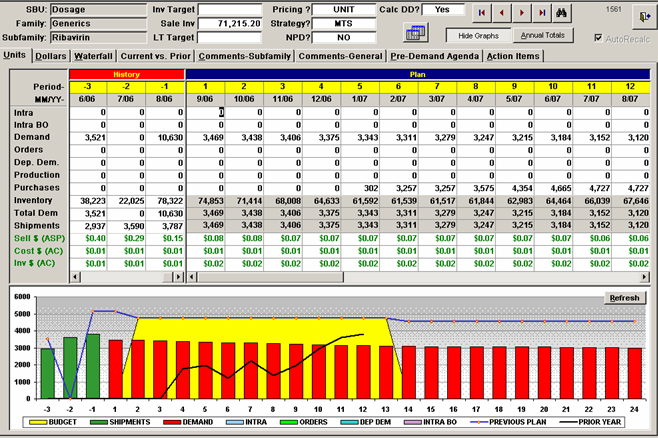
A screenshot of a spreadsheet in Microsoft Excel. The spreadsheet is divided into two columns and two rows. The first column is titled "SUBU" and the second column is labeled "Target". <br /><br />The first row of the spreadsheet has a table with columns labeled "Date" "Time" "Description" "Quantity" etc. The table has rows for the date quantity and description of the product. The table also has columns for the product name price and other relevant information.<br /><br />At the top of the table there is a toolbar with various options such as File Edit View Tools and Help. Below the toolbar there are buttons for "Save" "Cancel" "Help" etc.<br />- The second row has a bar graph with different colors representing the different types of products and their respective prices. The bar graph shows that the product has been sold at a discounted price with the highest price at the bottom and the lowest at the top. The graph also shows a line graph with a red and yellow color scheme representing the price of the products.

Title

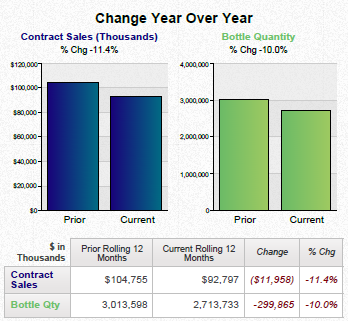
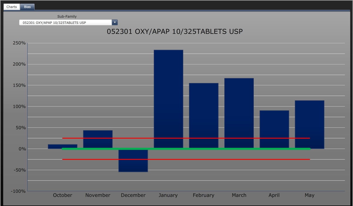
Ribavirin sales data dashboard : June 2006 through August 2007

Description Generated using AI

A screenshot of a spreadsheet in Microsoft Excel. The spreadsheet is divided into two columns and two rows. The first column is titled "SUBU" and the second column is labeled "Target".

The first row of the spreadsheet has a table with columns labeled "Date" "Time" "Description" "Quantity" etc. The table has rows for the date quantity and description of the product. The table also has columns for the product name price and other relevant information.

At the top of the table there is a toolbar with various options such as File Edit View Tools and Help. Below the toolbar there are buttons for "Save" "Cancel" "Help" etc.
- The second row has a bar graph with different colors representing the different types of products and their respective prices. The bar graph shows that the product has been sold at a discounted price with the highest price at the bottom and the lowest at the top. The graph also shows a line graph with a red and yellow color scheme representing the price of the products.

We encourage you to view the image in the context of its source document(s) and cite the source(s) when using these images. However, to cite just this image alone, click the “Cite This Image” button and then paste the copied text.
Information copied to your clipboard:

"Ribavirin sales data dashboard : June 2006 through August 2007." OIDA Image Collection. Available at https://images.oida-resources.jhu.edu/1ff63253-4...