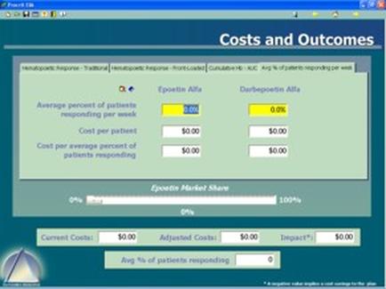
A screenshot of a spreadsheet in Microsoft Excel. The spreadsheet is divided into two columns and two rows. The first column is labeled "SUBU" and the second column is titled "Inventory".
The first row of the spreadsheet has a table with columns labeled "Date" "Description" "Quantity" "Price" "Strategy" "Unit" and "Description". The table has rows for the date quantity and price of each item. The second row has columns for the quantity price and description of the item.
At the top of the table there is a toolbar with various options such as "File" "Edit" "View" "Tools" "Help" "Options" etc. There are also buttons for "Help" and "Help".
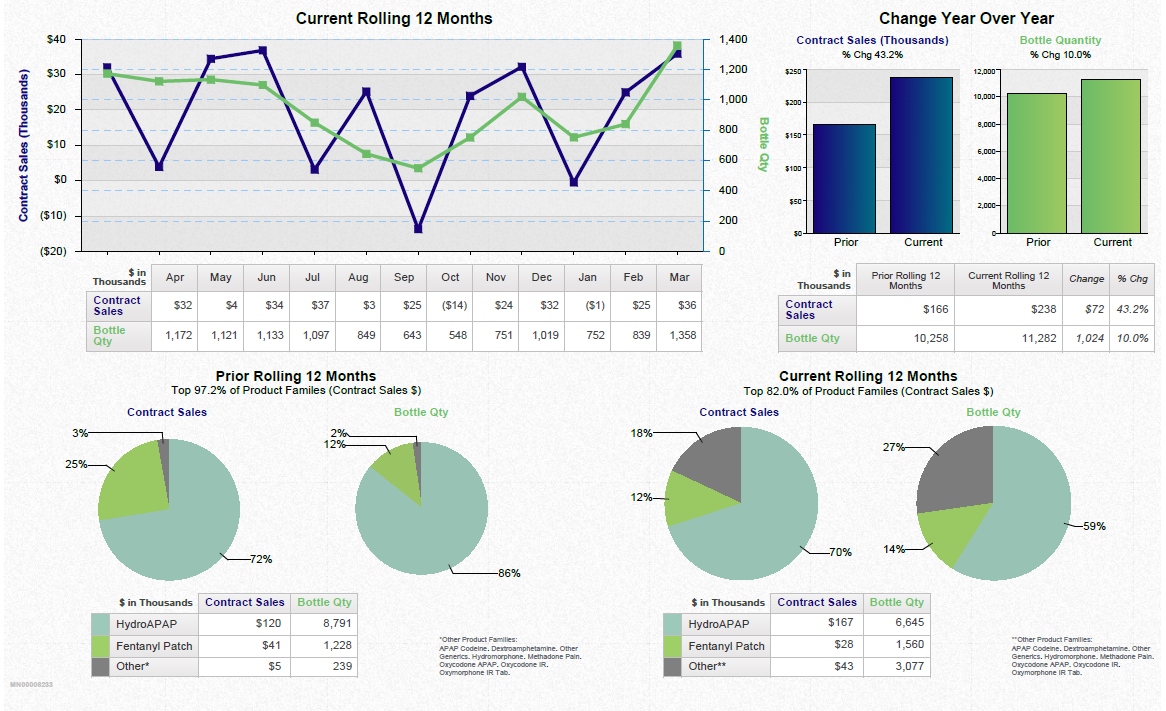
In the bottom right corner of the image there are two bar graphs one in red and one in white. The red bar graph shows the number of items in each category while the white bar shows the percentage of items that have been sold. The bars are arranged in ascending order with the highest percentage at the bottom and the lowest at the top.

Category
-
Date
2006
Collection
We encourage you to view the image in the context of its source document(s) and cite the source(s) when using these images. However, to cite just this image alone, click the “Cite This Image” button and then paste the copied text.


![A flow chart describing the pain management process from a physician's perspective in 5 sections accompanied by 7 annotations (marked by stars pointing to text boxes). The sections are Origin Evaluation and Diagnosis Treatment Choices [something to do with insurance coverage for prescriptions?] and Persistency. The annotations appear to refer to ways that Mallinckrodt Pharmaceuticals could increase the awareness sales and profitability of Exalgo. The background is white with graphic elements in blue gray green and yellow with text in black red and green.](https://oidaresourcesimages-cdn-endpoint-duhwc2gse6gdbng7.a01.azurefd.net/public/full/c3a89e52-3266-47c0-9ed9-fe67133608e2.png)


