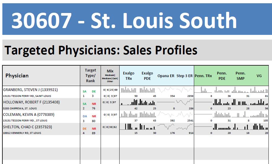
A screenshot of a table titled "30607 - St. Louis South Targeted Physicians: Sales Profiles". The table is divided into three columns and three rows. The first column is labeled "Physician" and the second column is titled "Targeted Physicians".
The first row of the table has three columns each representing a different type of physician. The second row has three rows the third row has four rows and the fourth row has six rows. Each row has a different color scheme - green blue and red.
At the top of the image there is a blue banner with the text "306067 - ST. LOUIS SOUTH" in white letters. Below the banner there are two columns labeled "Target" and "Sales Profiles" in black letters. The green column has a line graph the blue column has an x-axis representing the number of patients the red column has two lines representing the percentage of patients who have been diagnosed with cancer the white column shows the percentage that has been diagnosed the black line represents the percentage where the patients have died the green column shows that the patient has experienced a decrease in the percentage the yellow line represents a decrease the pink line represents an increase in the number that has decreased the purple line represents another decrease and finally the orange line represents some of the patients who are experiencing a decrease.
- The table also has a legend at the bottom that explains the meaning of each row.
Source 1 of 5
-
Date
2011
Collection
-
Date
2011
Collection
-
Date
2011
Collection
-
Date
2011
Collection
-
Date
2011
Collection
We encourage you to view the image in the context of its source document(s) and cite the source(s) when using these images. However, to cite just this image alone, click the “Cite This Image” button and then paste the copied text.


