OIDA Image Collection
Filters:
Reset 
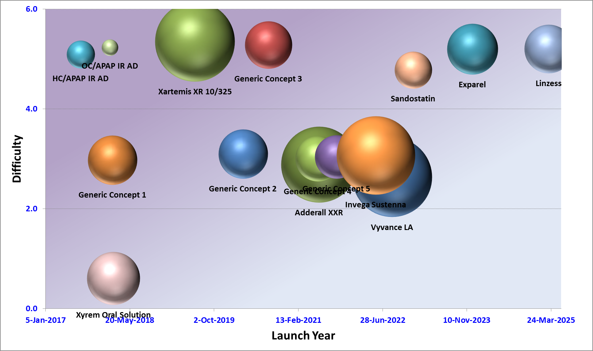
A line graph that shows the launch year of a company. The graph is divided into six sections each representing a different company. <br /><br />The first section is labeled "Difficulty" and shows the number of companies that have launched the company. There are six companies represented in the graph each with a different color - green red orange blue pink and purple. The companies are represented by spheres of different sizes and shapes.<br /><br />Next to each company there is a bar graph with the title "Launch Year" at the top. Below the title there are two bars one representing the company's launch year and the other representing the launch date. The first bar shows that the company has achieved a high level of success while the second bar shows a low level of failure. The third bar shows an increase in the company name indicating that the launch has been successful. The fourth bar shows how the company is expected to reach a peak in the next few years. The fifth bar shows what the company will look like in the first quarter of the year with a slight decline in the second quarter and a slight decrease in the third quarter. The sixth bar shows whether the company could launch a new product or service as indicated by the text at the bottom of the graph.

Description Generated using AI

A line graph that shows the launch year of a company. The graph is divided into six sections each representing a different company.

The first section is labeled "Difficulty" and shows the number of companies that have launched the company. There are six companies represented in the graph each with a different color - green red orange blue pink and purple. The companies are represented by spheres of different sizes and shapes.

Next to each company there is a bar graph with the title "Launch Year" at the top. Below the title there are two bars one representing the company's launch year and the other representing the launch date. The first bar shows that the company has achieved a high level of success while the second bar shows a low level of failure. The third bar shows an increase in the company name indicating that the launch has been successful. The fourth bar shows how the company is expected to reach a peak in the next few years. The fifth bar shows what the company will look like in the first quarter of the year with a slight decline in the second quarter and a slight decrease in the third quarter. The sixth bar shows whether the company could launch a new product or service as indicated by the text at the bottom of the graph.

We encourage you to view the image in the context of its source document(s) and cite the source(s) when using these images. However, to cite just this image alone, click the “Cite This Image” button and then paste the copied text.

Information copied to your clipboard:

"A line graph that shows the launch year of a company. The graph is divided into six sections each representing a different company.

The f...