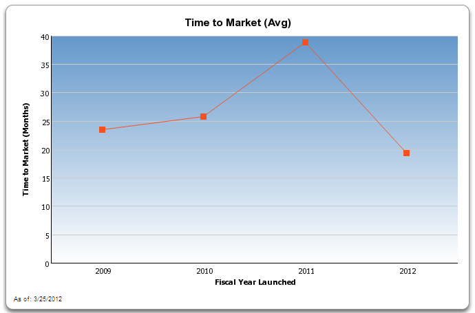
A line graph titled "Time to market (Avg)". The x-axis represents the years starting from 2009 and ending in 2012 with the y-axis representing the time to market in months. The graph shows that for 2009 it was slightly less than 25 months. For 2010 it was slightly more than 25 months. For 2011 it was close to 40 months and for 2012 it was approximately 20 months. Text at the bottom of the image indicates the data is as of 3/25/2012.
Description
-
Date
2012
Collection
We encourage you to view the image in the context of its source document(s) and cite the source(s) when using these images. However, to cite just this image alone, click the “Cite This Image” button and then paste the copied text.
