Title
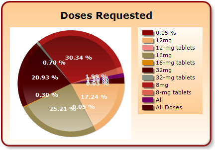
A pie chart that shows the percentage of doses requested for different types of tablets. The chart is divided into three sections each representing a different type of medication.
The largest section in the chart is red representing the percentage. The largest section is green representing 20.93% of the doses. The smallest section is yellow representing 17.24% of all doses.
On the right side of the chart there is a table with three columns - 0.05% 12mg 16mg 32mg and 8mg tablets. Each column has a color-coded bar representing the number of doses in each category. The table also has a legend that explains the meaning of each color. The background of the image is white and the text "Doses Requested" is written in black at the top.
Category
Source 1 of 3
-
Date
2010
Collection
-
Date
2010
Collection
-
Date
2010
Collection
We encourage you to view the image in the context of its source document(s) and cite the source(s) when using these images. However, to cite just this image alone, click the “Cite This Image” button and then paste the copied text.

