Title
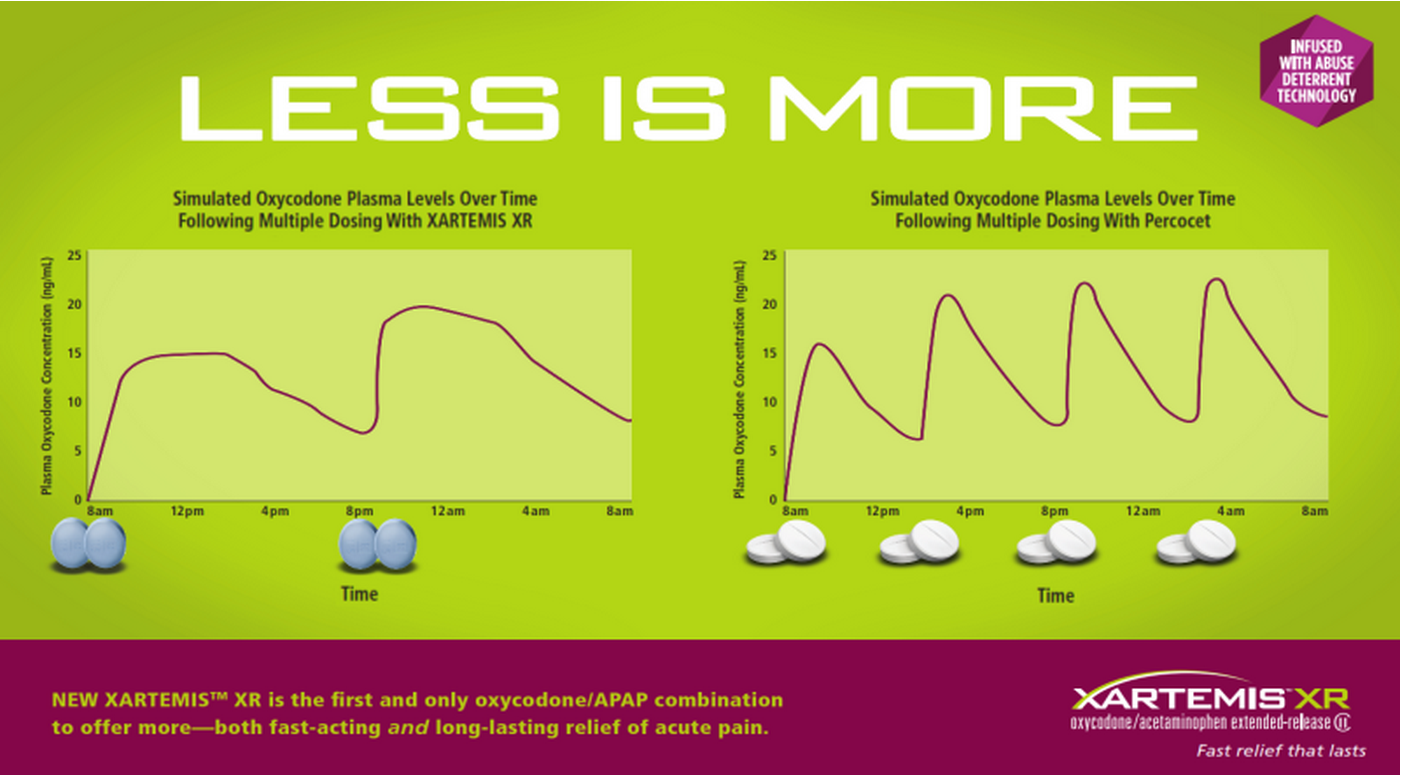
An infographic that explains the concept of "Less is more" and "Simulated Oxycodone Plasma Levels Over Time Following Multiple Dosing with XARTEMIS XR". It has two graphs one in red and one in green that show the relationship between the two levels.
The red graph shows that the first and only oxycodone/APAP combination to offer more-both fast-acting and long-lasting relief of acute pain is the first and the green graph shows a decrease in the number of patients who have been diagnosed with the condition. The x-axis of the graph represents the time period while the y-axis represents the percentage of patients with multiple dosing. The graph also shows a line graph that shows the percentage change in the percentage over time with the highest percentage at the top and the lowest at the bottom.
There are also two smaller graphs on the right side of the image one showing the same line graph and the other showing a decrease. The lines are plotted on a green background and there are three white pills on the bottom right corner of the infographic. The text on the infographic explains that the XARTEMIS XR is the fastest-acting long-acting solution for acute pain.
Category
Drug
Xartemis XR
Source 1 of 10
-
Date
None
Collection
-
Date
2013
Collection
-
Date
2013
Collection
-
Date
2013
Collection
-
Date
2013
Collection
-
Date
2013
Collection
-
Date
2013
Collection
-
Date
2012
Collection
-
Date
2012
Collection
-
Date
2013
Collection
We encourage you to view the image in the context of its source document(s) and cite the source(s) when using these images. However, to cite just this image alone, click the “Cite This Image” button and then paste the copied text.
