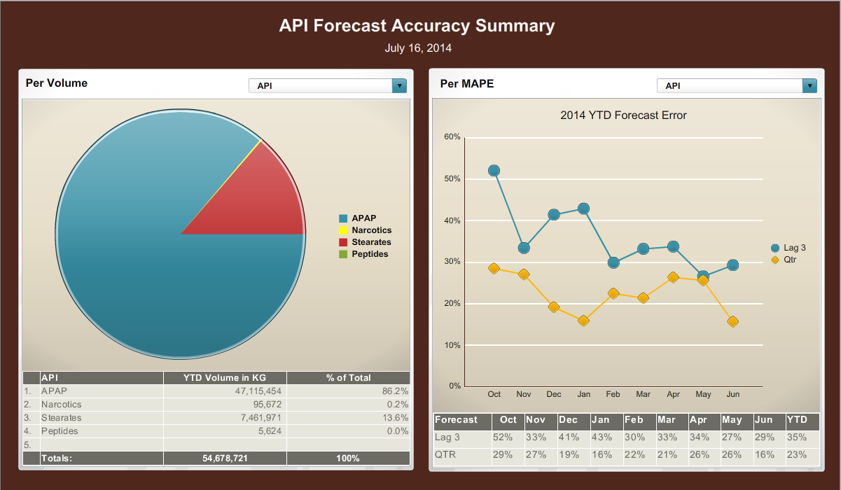
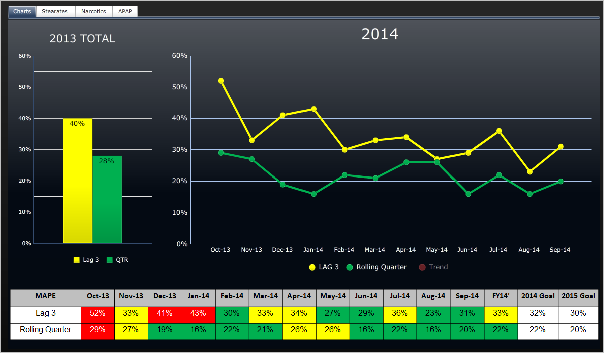
A web-based data visualization from the Charts tab (other tabs being Stearates Narcotics APAP). It consists of a bar chart a run chart and a table. The bar chart with the title "2013 Total" compares Lag 3 (40%) to QTR (28%). The run chart with the title "2014" compares LAG 3 (in yellow) to Rolling Quarter (in Green) both of which show a general downward trend between October 2013 and September 2014. The table compares Lag 3 to Rolling Quarter on a monthly basis from October 2013 to September 2014 (plus FY14 2014 Goal and 2015 Goal). Individual cells therein are color-coded in red yellow and green with red representing higher values yellow representing medium values and yellow representing lower values. The background is black with graphic elements in yellow green and red with text in white and black.
Description
-
Date
2014
Collection
We encourage you to view the image in the context of its source document(s) and cite the source(s) when using these images. However, to cite just this image alone, click the “Cite This Image” button and then paste the copied text.


