Title
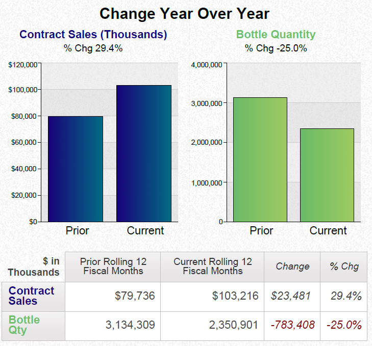
A bar graph that shows the Change Year Over Year for Contract Sales (in Thousands of dollars) and Bottle Quantity comparing the Prior Years (on the left) to the Current Years (on the right).
There is also a table showing Contract Sales and Bottle Quantity for the Prior Rolling 12 Fiscal Months the Current Rolling 12 Fiscal Months Change (in thousands of dollars) and Change (in percentage).
The data visualizations show that Contract Sales are up in both dollars and percentage while Bottle Quantity is down in both dollars and percentage when comparing the two time periods.
Category
Source 1 of 4
-
Date
2014
Collection
-
Date
2014
Collection
-
Date
2014
Collection
-
Date
2014
Collection
We encourage you to view the image in the context of its source document(s) and cite the source(s) when using these images. However, to cite just this image alone, click the “Cite This Image” button and then paste the copied text.


