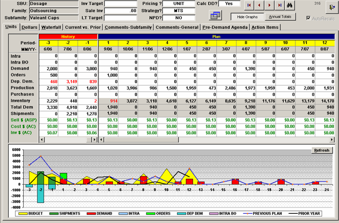
A line graph that shows the current year-to-date vs. prior year-date of a product. The x-axis represents the months of the year starting from January to December and ending at the end of the month.
The graph has three lines each representing a different period of time. The first line is blue the second line is green the third line is purple and the fourth line is orange. The lines are plotted in a horizontal axis with the blue line representing the current period and the green line representing a previous period. The graph shows that the product has been steadily increasing over the years with a slight decline in the past few months. The blue line represents the price of the product while the orange line represents a significant increase in the price. The green line represents an increase in price with an increase of around $1000000 in the first quarter of the second quarter and a decrease in the third quarter.
There are also two bars on the graph one in blue and one in green which represent the price and the other in blue. The bars are labeled "Current Year-to Date vs. Prior Year-Date" and "Prior Year-To-Date". The graph also has a legend at the bottom that explains the meaning of each bar. The background of the graph is white and there is a title at the top that reads "Current Rolling 12 Months".

-
Date
2015
Collection
We encourage you to view the image in the context of its source document(s) and cite the source(s) when using these images. However, to cite just this image alone, click the “Cite This Image” button and then paste the copied text.





![This is a table originally created by Mitsikostas (unpublished). Values on the x-axis are : ARISE (3m) Dodick Cephalalgia 2018; STRIVE (6m) Goadsby NEJM 2017; and STRIVE (6m) Goadsby NEJM 2017 [potentially a typo?]. Values on the y-axis are : mAb Placebo N mAb N 50% RR for Placebo 50% RR for mAb any AE for placebo any AE for mAb disc AE for placebo and disc AE for mAb.](https://oidaresourcesimages-cdn-endpoint-duhwc2gse6gdbng7.a01.azurefd.net/public/full/da8f89d0-c1ca-42c2-89e9-392adc09a4d8.png)

