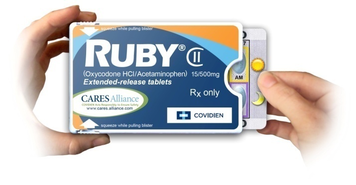
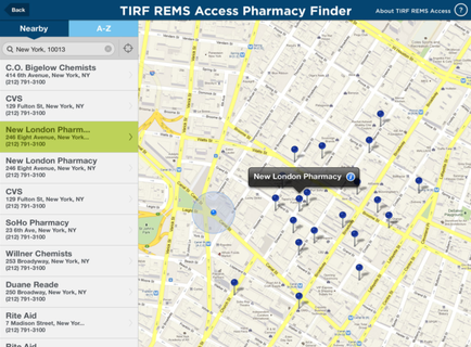
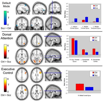
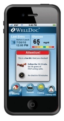
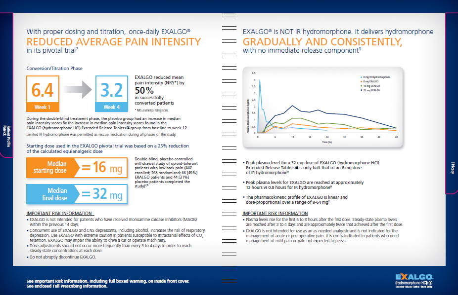
The image provides information about Exalgo. It has a white background with a blue border. It is split into two sections.
On the left side of the image there is a title "With proper dosing and titration once-daily Exalgo reduced average pain intensity in its pivotal trial." The left side of the page shows various graphics relating to the conversion and titration phase median starting and final doses and important risk information.
The right side of the page has the title "Exalgo is NOT IR hydromorphone. It delivers hydromorphone gradually and consistently with no immediate-release component." There is a line graph showing plasma hydromorphone over time showing that Exalgo is more gradual and steady than other products. There are a number of bullet points explaining the line graph as well as additional important risk information. The Exalgo logo is at the bottom right corner.
Description
Category
Source 1 of 5
-
Date
2012
Collection
-
Date
2011
Collection
-
Date
2012
Collection
-
Date
2012
Collection
-
Date
2011
Collection
We encourage you to view the image in the context of its source document(s) and cite the source(s) when using these images. However, to cite just this image alone, click the “Cite This Image” button and then paste the copied text.


