Title
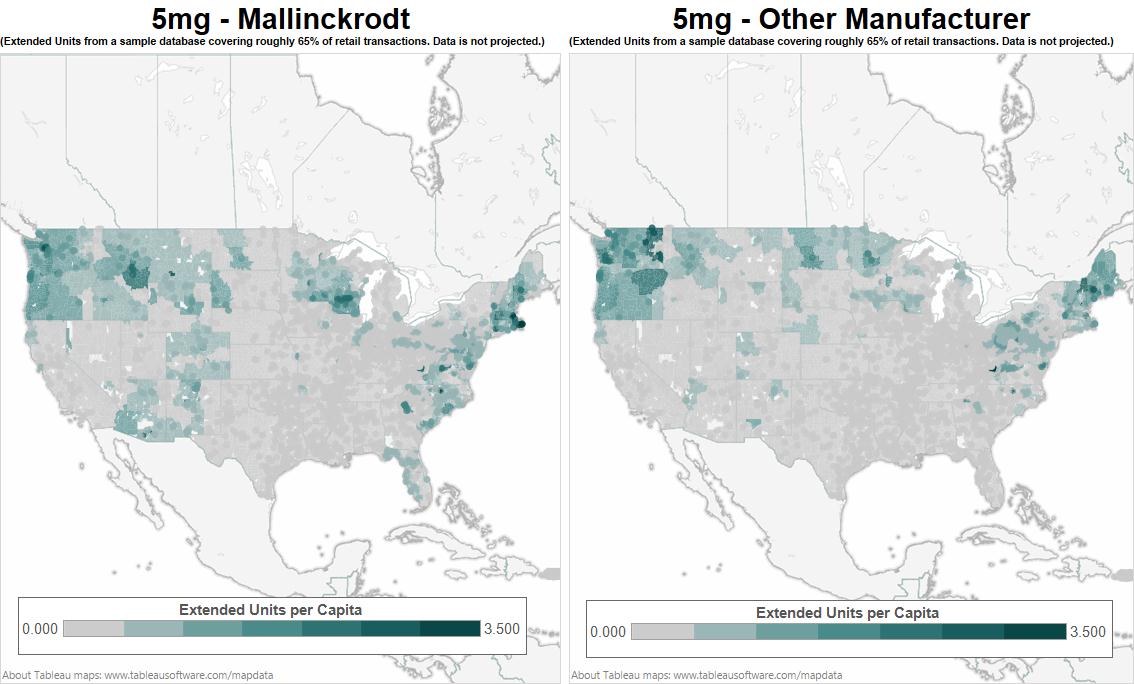
A map of the United States showing the percentage of extended units per capita in each state. The map is divided into two sections with the left side showing the extent of the extended units and the right side showing an extended unit per capita.
The map is color-coded with different shades of blue representing different areas of the country. The blue areas represent extended units while the green areas represent other manufacturing units. The areas are darker in color indicating higher levels of manufacturing. The percentages range from 0.000 to 3.500 with some areas being higher than others. The text on the map provides additional information about the data such as the number of units in each region and the percentage in each area. The image also includes a legend at the bottom that explains the meaning of each color.
Category
Source 1 of 6
-
Date
2013
Collection
-
Date
2013
Collection
-
Date
2013
Collection
-
Date
2013
Collection
-
Date
2013
Collection
-
Date
2013
Collection
We encourage you to view the image in the context of its source document(s) and cite the source(s) when using these images. However, to cite just this image alone, click the “Cite This Image” button and then paste the copied text.

