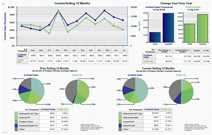
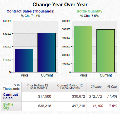
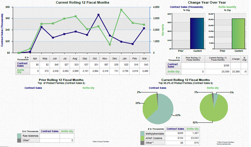
A screenshot of an Excel spreadsheet that shows the current rolling 12 fiscal months and the change year over year. The spreadsheet is divided into two sections.
The top section has a line graph that shows that the current fiscal month has been steadily increasing over time with the x-axis representing the years and the y-axis indicating the percentage change. The line graph shows a steady increase in the number of months with a slight decline in the percentage. The graph also shows a bar graph that represents the change in the year over the years with different colors representing the different months.
On the right side of the spreadsheet there are two graphs - one in blue and one in green. The blue graph shows an upward trend indicating a decrease in the amount of money spent on the fiscal month. The green graph represents a decrease while the blue graph represents an increase.
- There are also two pie charts in the bottom right corner of the image one showing the percentage changes in the fiscal year and the other showing a decrease. The pie chart on the bottom left corner shows that there is a decrease of the percentage of the total amount spent on each month with an increase of around $1000 in the first quarter of the year and a decrease from around $2000 to around $3500 in the second quarter.
Category
Source 1 of 2
-
Date
2017
Collection
-
Date
2013
Collection
We encourage you to view the image in the context of its source document(s) and cite the source(s) when using these images. However, to cite just this image alone, click the “Cite This Image” button and then paste the copied text.


